Our PowerPoint measurement diagrams collection is crafted to bring structure to your data stories. Perfect for illustrating processes, hierarchies, and relational measurements, these templates cater to strategists, consultants, and educators aiming for impactful deliveries.
With options like Sankey diagrams for energy measurements or tree maps for hierarchical metrics, you`ll find tools that adapt to any narrative. Fully vector-based, they resize without quality loss and integrate SmartArt enhancements for quick edits. Elevate mundane reports into engaging journeys that audiences follow effortlessly.
Targeted at those juggling complex datasets, these diagrams simplify comparisons and progressions. Peruse our variety and select templates that resonate with your vision. Begin downloading to infuse professionalism into your very next presentation.
These diagrams leverage PowerPoint`s connector tools for fluid representations, outpacing basic shapes with auto-alignment and theme syncing. They`re indispensable for visualizing measurement flows in operations or science.
For nonprofits, cycle diagrams measure impact loops in program evaluations. They eclipse generic diagrams by including measurement legends and conditional formatting for thresholds.
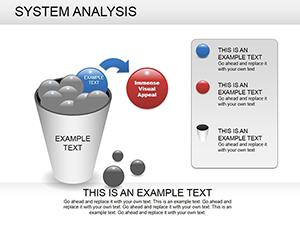
Begin with stakeholder mapping: choose linear diagrams for sequential measurements to guide viewers logically. Employ dashed lines for provisional data and solid for confirmed, enhancing trust. Limit nodes to seven per view to prevent clutter.
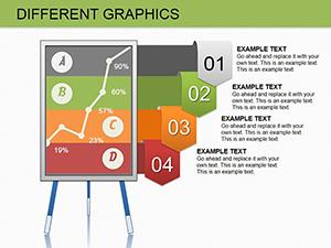
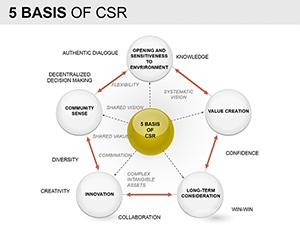
Our distinction? Modular blocks that snap together, facilitating hybrid diagrams like process + hierarchy combos for comprehensive measurements.
Default PowerPoint diagrams demand extensive formatting; ours arrive styled with gradients and shadows, ready for metrics like throughput rates. They also embed hyperlinks for drill-downs to detailed sheets.
Empower your slides - select and download a diagram today.
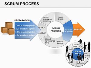
In logistics, a swimlane diagram measured delivery efficiency across departments, reducing bottlenecks visually. An academic used a mind map for psychological measurement scales, branching traits dynamically.
Innovate by overlaying icons on nodes, e.g., clocks for time measurements in project overviews.
Act now - download and diagram your way to clarity.
Harness these diagrams to measure and motivate. Your audience awaits.
Copyright © 2009-2026 ImagineLayout All rights reserved.