Manager PowerPoint Charts
Management charts help leaders communicate structure strategy and performance clearly.
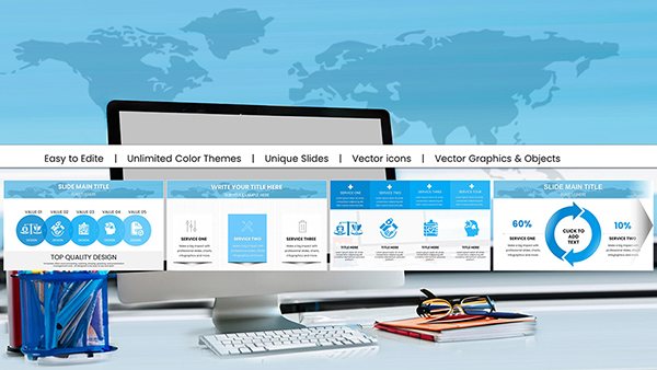
We offer more than 100 specialized management chart PowerPoint templates designed for executives managers and teams.
All templates are fully customizable include modern layouts and smooth animations making complex hierarchies easy to present.
Great for organizational updates strategy sessions or team alignment meetings.
Try free designs or upgrade to premium styles.
-
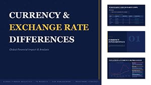
Currency Exchange Rate Differences PowerPoint Template
ID: #PC01136
-
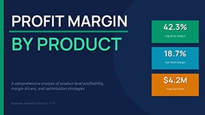
Profit Margin by Product Chart Template for PowerPoint
ID: #PC01135
-
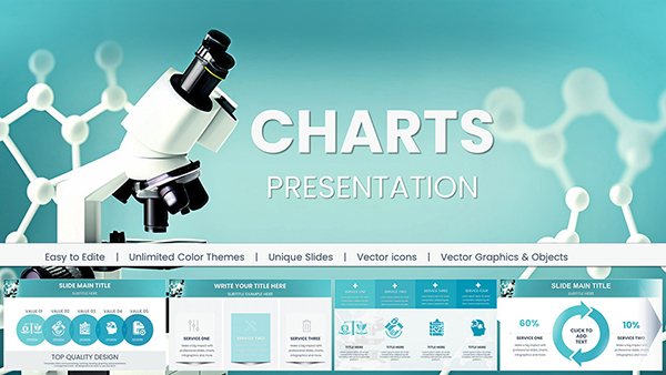
Pro Chemical & Biochemical Education PowerPoint Charts
ID: #PC01062
-
Pro Plumbing Flow PowerPoint Charts Template
ID: #PC01059
-
Online Education PPT Charts Template Download
ID: #PC01046
-
Chemical and Biochemical Engineering PowerPoint Charts: Precision Tools for Complex Insights
ID: #PC01041
-
Educational PowerPoint Charts: Igniting Minds with Visuals
ID: #PC01037
-
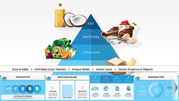
Food Pyramid PowerPoint Charts for Nutrition
ID: #PC00989
-
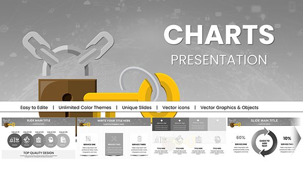
Security PowerPoint Charts: Key Access Templates
ID: #PC00983
-
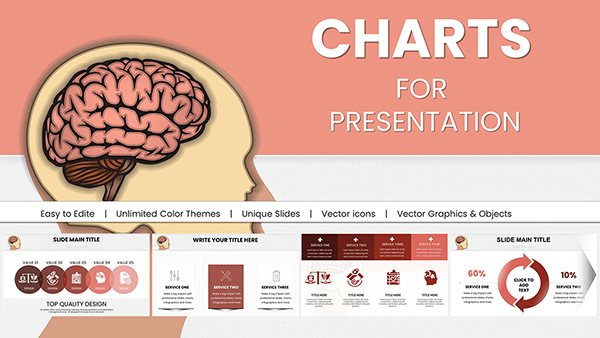
Brain Five Senses PowerPoint Infographics Template
ID: #PC00948
-
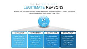
Legitimate Business Success PowerPoint Charts Template: Unlock Professional Excellence
ID: #PC00872
-
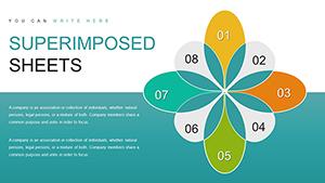
Superimposed Boundary Sheets PowerPoint Charts - Instant Download | ImagineLayout
ID: #PC00849
-
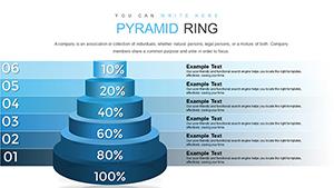
Pyramid Ring PowerPoint Charts Template
ID: #PC00847
-
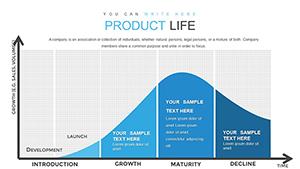
Product Lifecycle PowerPoint Charts Template: Visualize Success Stages
ID: #PC00840
-
Momentum Concept PowerPoint Charts Template - Presentation
ID: #PC00834
-
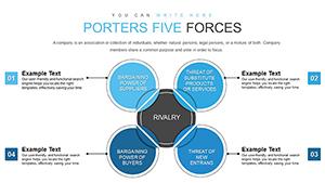
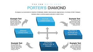
Porter's Five Forces PowerPoint Template: Strategic Analysis for Architects
ID: #PC00825
-
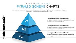
Pyramid Scheme PowerPoint Template: Empower Awareness and Prevention
ID: #PC00816
-
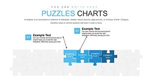
Puzzles for Analytics Interviews PowerPoint Charts Template
ID: #PC00812
-
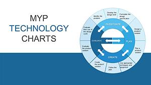
MYP Technology Pie Chart PowerPoint Template
ID: #PC00813
-
3D Cubes Porter's Five Forces PowerPoint Template
ID: #PC00806
-
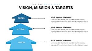
Vision, Mission, and Targets PowerPoint Charts Template: Empower Your Strategic Narrative
ID: #PC00783
-
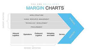
Dynamic Margin Analysis PowerPoint Charts: Unlock Business Insights with Precision
ID: #PC00770
-
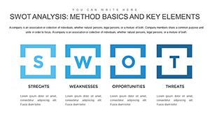
Method SWOT Analysis PowerPoint Charts Template for Strategy
ID: #PC00752
-
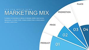
Marketing Mix PowerPoint Charts Template: Transform Strategies into Visual Masterpieces
ID: #PC00719
Benefits of Professional Management Charts
Basic org charts and dashboards look dated quickly. Our templates deliver contemporary design smart layouts and instant professionalism.
Typical Applications
Organizational Structure
Display reporting lines team roles and department relationships.
KPI Dashboards
Track key metrics goals and performance indicators.
Project Hierarchy
Show team responsibilities and leadership chains.
Strategy Roadmaps
Outline initiatives timelines and ownership.
Advantages Over Standard Tools
- Automatic layout adjustments
- Professional color themes
- Pre-built KPI gauges and meters
- Animated reveals for impact
- Easy photo integration for team members
Design Tips for Management Charts
Keep hierarchy levels visible but not overwhelming. Use color to highlight leadership roles.
Add photos for personal touch. Animate entrances by level. Balance text and white space.
Need better leadership visuals? Check out our management chart collection and download now.
Frequently Asked Questions
Do you offer free management chart templates?
Yes. Free versions are available along with premium advanced designs.
Can I add employee photos easily?
Yes. Most templates include placeholder frames ready for photos.
Will the layout adjust if I add more boxes?
Many templates use smart layouts that reorganize automatically.
Are dashboard gauges included?
Premium templates feature customizable KPI gauges and progress indicators.