Presenting financial losses operational gaps or risk exposure requires more than plain charts. You need visuals that explain causes impact and recovery strategies clearly. Our Loss Analysis Keynote Diagram Templates are designed to transform complex negative performance data into structured visual stories that decision makers understand instantly.
Whether you are preparing a board report risk assessment insurance review or academic case study these ready to use Keynote slides help you communicate downturns profit decline damage reports or cost overruns with clarity and professionalism. Fully editable layouts allow you to adjust colors data blocks and process flows in minutes so you can focus on insights instead of formatting.

Default presentation slides often lack structure when explaining negative trends or operational failures. Loss related topics demand clarity logic and visual hierarchy. These Keynote diagram templates are built to guide your audience from problem identification to root cause analysis and recovery strategy.
Each slide is designed to highlight critical data without overwhelming your audience. Clear typography logical layout zones and visual emphasis areas help you deliver confident presentations even when discussing sensitive performance issues.
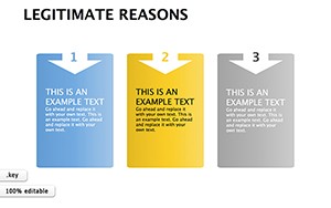
Explain revenue decline cost overruns budget deviations or profit reduction with structured comparison diagrams. These templates help CFOs analysts and consultants present loss scenarios with actionable clarity.
Use visual frameworks to demonstrate risk exposure loss forecasting damage evaluation or mitigation strategies. Ideal for internal audits insurance presentations and compliance reporting.
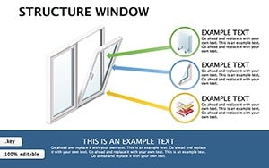
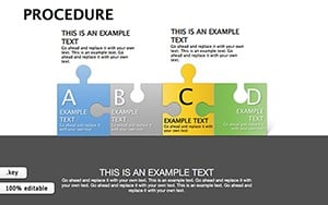
Show production losses downtime analysis supply chain disruptions or quality failures using step based diagram models that highlight bottlenecks and corrective measures.
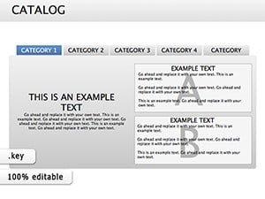
Perfect for case studies economic analysis or academic presentations where structured explanation of negative outcomes is essential for learning and discussion.
Generic Keynote slides require manual diagram building which consumes time and may result in inconsistent layouts. These ready made diagrams provide:
Instead of explaining complex loss scenarios verbally you can rely on visual logic that strengthens your credibility and improves audience understanding.
When presenting sensitive data keep slides clean and focused. Avoid excessive animation and let the diagram guide the narrative step by step.
Download these professional Keynote loss diagrams today and turn complex negative data into confident strategic presentations.
Yes all shapes charts and text elements can be customized including colors fonts and data values.
Absolutely these layouts are designed for professional environments including executive reviews and investor presentations.
Yes the collection includes cause effect models risk breakdown structures and loss impact visuals.
Yes they are ideal for presenting claim analysis damage assessments and compliance findings.
Copyright © 2009-2026 ImagineLayout All rights reserved.