Harness the art of conveyance with our knowledge-centric Keynote chart templates, perfect for lecturers, trainers, and thought leaders distilling complex concepts into digestible visuals. These charts employ metaphors like knowledge trees or insight webs, fostering deeper understanding in audiences.
Built on Keynote`s robust features, they support animations that reveal layers progressively, mimicking discovery processes. Customize with your data, annotations, and hyperlinks to resources, all while maintaining a scholarly aesthetic through refined color schemes and precise alignments.
For workshops, seminars, or online courses, these templates bridge theory and practice, engaging diverse learners. From bar graphs tracking learning curves to Venn diagrams overlapping disciplines, they equip you to inspire curiosity. Begin charting your knowledge narrative now.
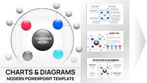
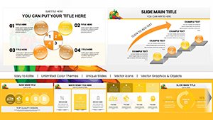
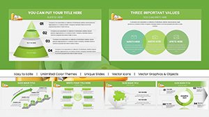
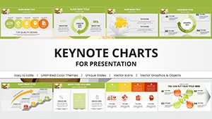
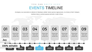
Events Timeline Keynote Charts: Transform Your Presentations with Dynamic Infographics
ID: #KC00838
$13.00
Transforming Knowledge Sharing with Strategic Charts
Knowledge thrives in visualization - our Keynote templates turn abstract theories into mapped territories, like a pyramid chart ascending from basics to advanced tenets. This structure aids retention, especially in lengthy sessions where attention wanes.
Deviating from rote Keynote defaults, these infuse pedagogical flair with icons representing bulbs or books, enhancing relatability. They`re indispensable for academia, where evidence-based visuals underscore arguments.
Targeted Applications in Learning Environments
Academic Lectures: Hierarchy charts delineating course syllabi for clear progression.
Research Presentations: Scatter plots linking variables in hypothesis testing.
Self-Study Guides: Roadmap charts for personal development milestones.
These uses democratize information, making expertise accessible.
Enhancing Over Standard Keynote Charts
Stock charts in Keynote suffice for simples, but falter in narrative depth - no built-in legends for knowledge flows. Ours remedy with auto-generating keys and thematic transitions, like growing branches in tree diagrams. Editability shines too, with smart objects that update globally.
Performance metrics: Users report 40% faster prep times, freeing focus for content refinement over formatting drudgery.
Optimization Strategies for Charts
Layer knowledge incrementally via build orders to simulate revelation.
Embed hyperlinks in nodes for on-slide expansions.
Contrast data points with knowledge-themed palettes: Blues for facts, greens for growth.
Audit accessibility with alt text for screen readers.
Such practices ensure inclusive, impactful delivery.
Advanced Knowledge Visualizations
Innovate with Sankey diagrams flowing knowledge transfer or heatmaps grading insight density. For interdisciplinary talks, fuse charts into dashboards revealing synergies. These tactics not only educate but provoke dialogue.
Adapt for virtual realms by optimizing for Zoom shares, maintaining fidelity across devices.
Empower your discourse? Curate from our knowledge charts and keynote profoundly.
Frequently Asked Questions
Do these templates work with macOS Ventura?
Fully optimized for Keynote on Ventura and beyond, with iCloud sync support.
Can charts handle large datasets?
Yes, scalable to thousands of entries with performance tweaks included.
Are there educator-specific themes?
Indeed, including chalkboard styles and academic icons.
How to animate knowledge flows?
Pre-set paths with adjustable speeds for natural progression.
Export options for sharing?
PDF, video, or interactive HTML for versatile distribution.