Demystify investment landscapes with our chart-centric PowerPoint templates. Tailored for financial experts, these designs excel in data visualization, featuring pie charts, line graphs, and dashboards that reveal trends at a glance. Ideal for portfolio reviews, funding pitches, or market analyses, they turn numbers into narratives that persuade and inform.
Gain efficiency with pre-linked Excel imports, scalable visuals, and investor-friendly layouts. Focus on insights, not formatting, to build trust and drive decisions.
Scan our assortment and choose the template that aligns with your fiscal goals. Download now to chart a course for compelling presentations.
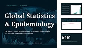
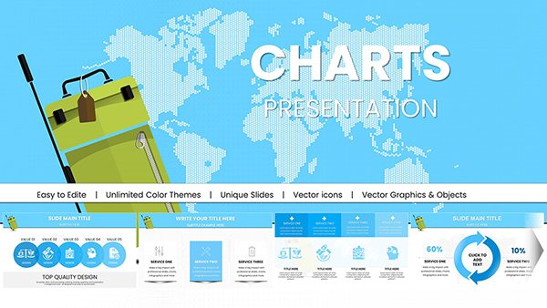
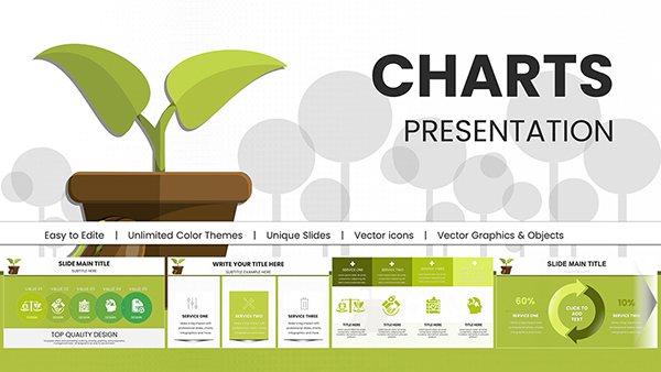
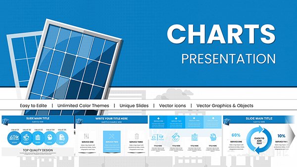
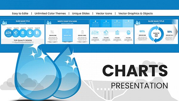
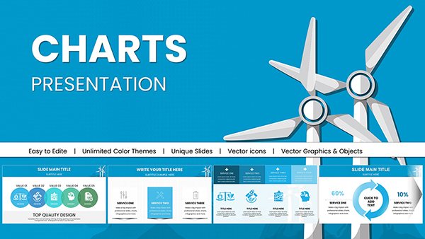
Sustainable Development PowerPoint Charts Template
ID: #PC00553
$15.00
(237)
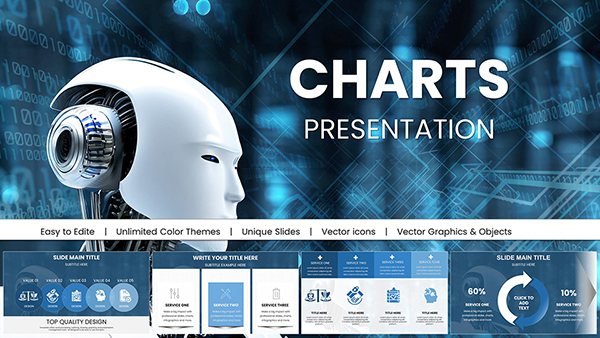
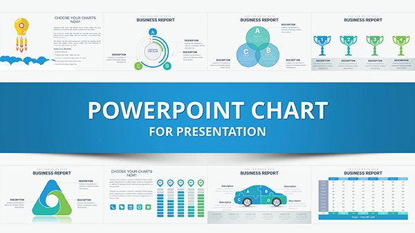
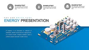
Information Animation PowerPoint Charts Template: Bring Data to Life Effortlessly
ID: #PC00445
$18.00
(1011)
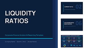
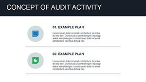
Concept of Audit Activity PowerPoint Charts - Precision in Compliance
ID: #PC00439
$18.00
(710)
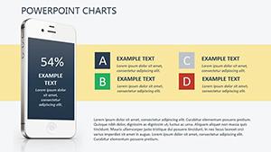
Mobile Shop PowerPoint Charts for Business Growth
ID: #PC00414
$16.00
Harnessing Charts for Investment Clarity
Investments thrive on clear data - our PowerPoint templates make it effortless. From ROI breakdowns to asset allocations, integrated charts provide depth without density. Finance pros appreciate the automation, updating figures dynamically for real-time accuracy.
Outpacing standard charts, ours include trend forecasts and comparative overlays, perfect for volatile markets. Customize axes and legends to match branding seamlessly.
Core Applications in Finance
Portfolio Overviews: Bar graphs comparing returns across assets.
Forecast Projections: Area charts projecting growth scenarios.
Follow best practices: Anchor charts with context summaries and use consistent scales. This fosters credibility and aids strategic planning.
Practical Examples and Enhancements
Venture capitalists might layer funnel charts over funding stages; advisors could stack donut visuals for diversification. Example: A hedge fund manager depicting quarterly yields with waterfall diagrams, spotlighting key variances. Or a real estate investor mapping property values via bubble charts.
Add interactivity with hyperlinks to detailed reports. Ensure print-ready exports for board meetings, broadening utility.
Invest in Better Presentations
Empower your financial discourse with these versatile templates. Download and deploy for sharper insights. Visit our analytics tools section for more.
Frequently Asked Questions
Do charts support Excel data?
Yes, direct imports keep visuals synced with live spreadsheets.
Editable for custom metrics?
Fully, with formula-friendly fields for tailored calculations.
Optimized for large datasets?
Performance-tuned for smooth handling of extensive figures.
Compatible with team collaboration?
Cloud-ready for shared editing in real-time.
Include accessibility features?
Alt text and color-blind modes built-in for inclusive viewing.