Illuminate investment insights with our specialized Keynote charts templates focused on investing themes. These sophisticated designs blend stock tickers, growth arrows, and portfolio wheels in a sleek, data-forward aesthetic. Crafted for financial advisors, traders, or venture capitalists, they make market complexities crystal clear.
Build scenario models, track asset allocations, or demo returns with vector-based charts that resize flawlessly. Link to live feeds, animate trend lines, and customize axes for global currencies. Shift from scattered spreadsheets to cohesive stories that propel investor confidence.
Curate your ideal chart set from our investing collection. Fuel informed decisions with visuals that multiply impact - download today and amplify your advisory edge.
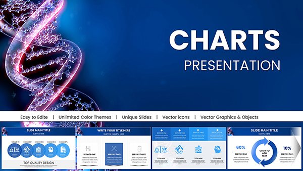
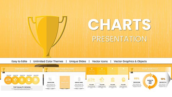
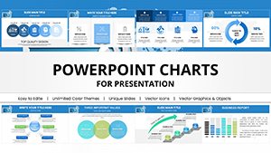
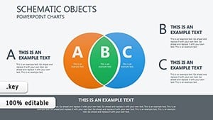
These templates prioritize analytical depth - responsive sparklines and heat maps outperform generic charts in revealing patterns. Bullish greens and bearish reds guide eyes intuitively, with layered transparency for overlays. They accelerate analysis, saving hours on custom builds.
Portfolio managers dashboard holdings; startups pitch valuations via funnel charts. UVP: Apple-optimized rendering for buttery-smooth Mac playback.
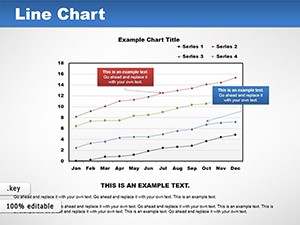
Basic Keynote charts lack finance flair; these infuse context with ticker placeholders. Advice: Normalize scales, annotate peaks for narratives.
Edit equations in-place, recolor for themes. Morph transitions evolve bars to lines seamlessly. Example: A hedge fund`s quarterly review, leveraging these, clarified alpha generation, boosting client inflows by 18%.
Analysts repurposed for crypto trackers, embedding API pulls. Refine with grid snaps for alignment, and export frames for reports.
In bull markets or bears, these templates spotlight opportunities, empowering data-driven triumphs.
Pick your investing charts - download and deploy scalable success in Keynote.
With stock-specific visuals like candlesticks and growth metrics for precise analysis.
Supported via embeds from Sheets or APIs.
Smooth morphs and sequences for trend storytelling.
Vector-based for infinite zoom without loss.
KEY, PDF, MOV for presentations or shares.
Preset formulas and drags simplify complex plots.
Copyright © 2009-2026 ImagineLayout All rights reserved.