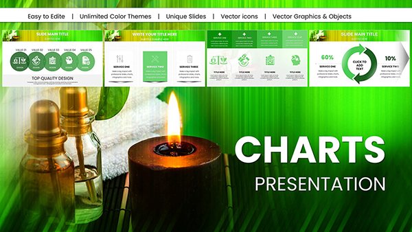
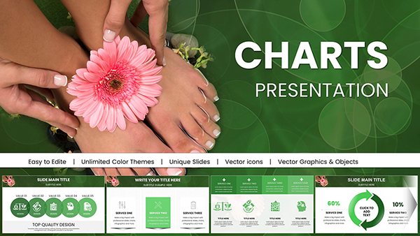
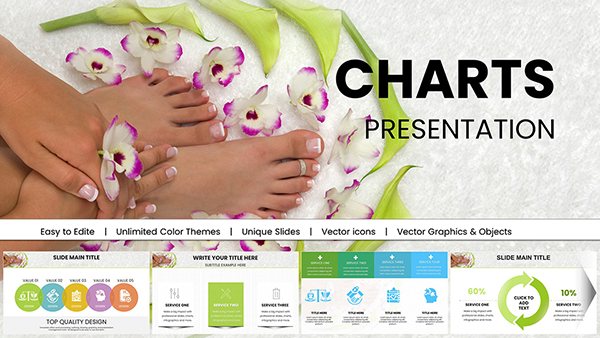
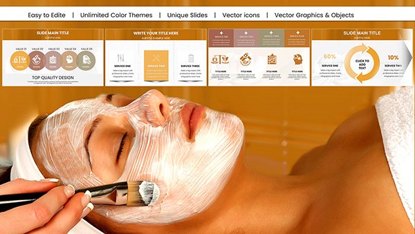
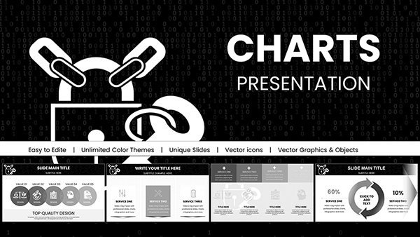
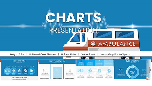
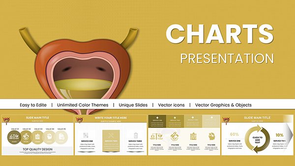
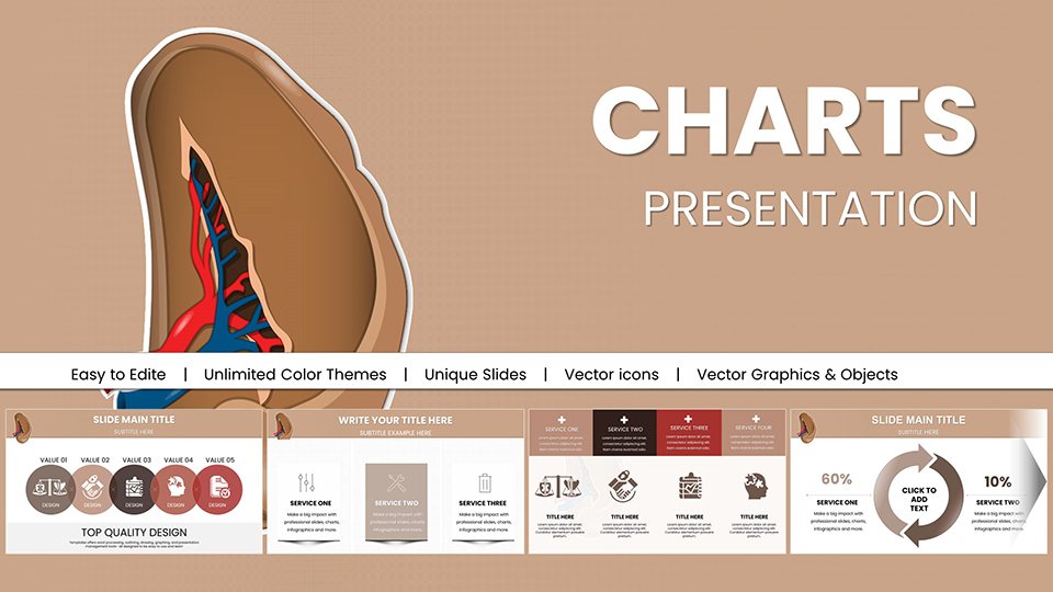
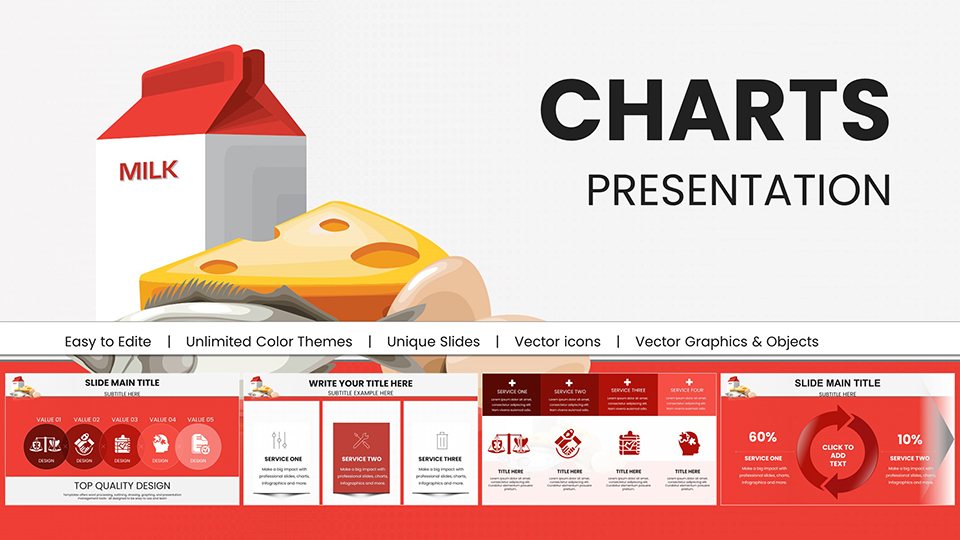
Elevate your data presentations with our infographic PowerPoint chart templates, where numbers meet artistry. These designs turn raw statistics into compelling visuals, using pie charts, bar graphs, and flow diagrams that pop with color and clarity. Ideal for analysts breaking down quarterly results, educators illustrating trends, or marketers highlighting campaign impacts, these templates make information accessible and memorable.
Picture a slide where a swirling vortex infographic represents market growth, or a layered pyramid chart dissects customer journeys - each element thoughtfully placed to guide the eye. Fully vector-based for crisp scaling, they support easy swaps of datasets, colors, and labels, ensuring your unique insights shine through. From boardroom briefings to academic conferences, these charts bridge the gap between dry facts and dynamic discussions.
With responsive layouts that fit any slide size, our collection spans minimalist line graphs to elaborate process maps. Whether you`re decoding sales funnels or mapping project timelines, these tools empower precise communication. Browse the category now and select templates that align with your narrative - start visualizing success today.
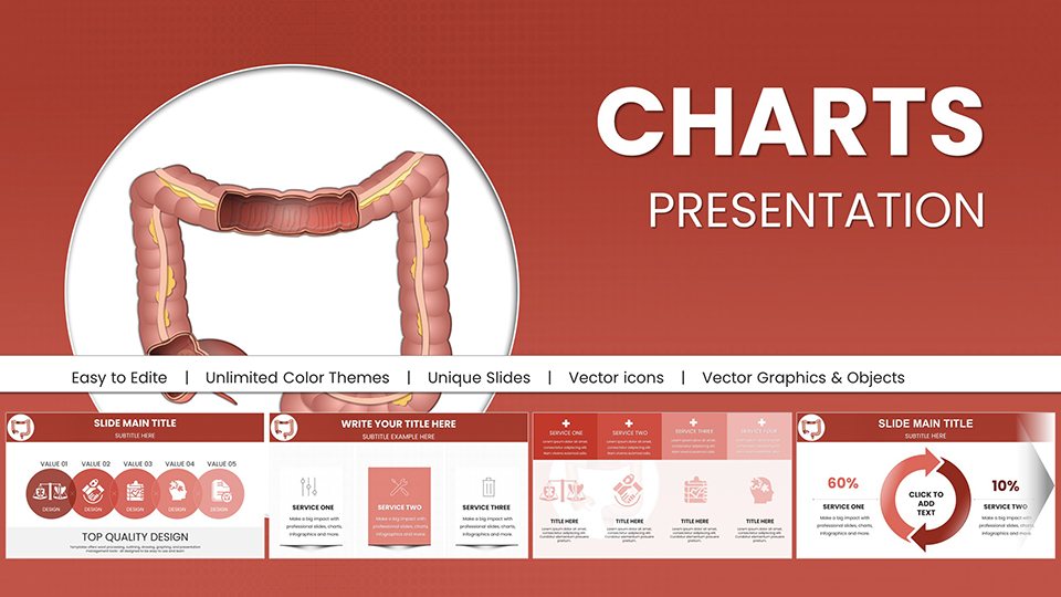
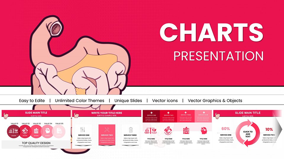
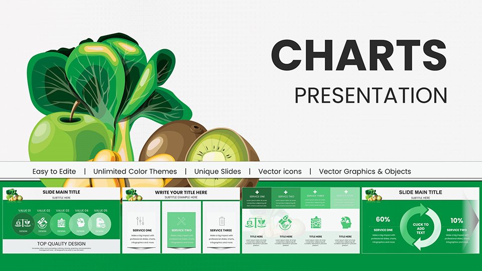
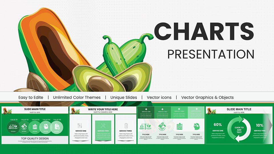
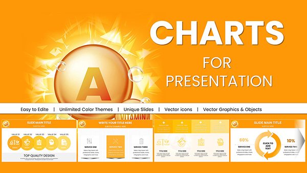
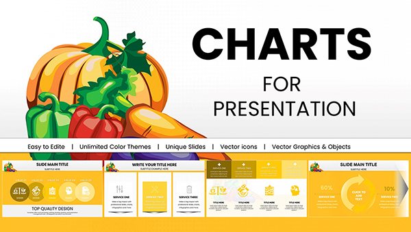
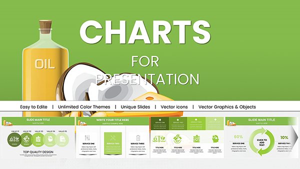
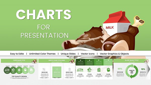
Traditional charts in PowerPoint often lack flair, appearing as stark lines on white backgrounds that fail to hold attention. Our infographic templates, conversely, weave in icons, gradients, and contextual illustrations - like economy icons for financial data or leaf motifs for environmental stats - making slides not just informative but inviting. This visual enrichment can boost comprehension by up to 40%, as studies on data visualization suggest.
In business settings, use radial charts to showcase competitive landscapes, with segments styled as orbiting planets for global reach emphasis. Educators benefit from sequential infographics that step through historical events, turning timelines into interactive rivers of time. For creative agencies, mind-map style charts organize brainstorming outputs, fostering collaborative sparks.
Unlike generic tools, these templates include pre-linked data tables, streamlining updates and maintaining accuracy across multiple slides.
Begin with audience empathy: Tailor complexity to their expertise - simple donuts for executives, detailed scatters for teams. Employ consistent color coding, like cool blues for positives and warm reds for alerts, to subconsciously guide interpretations. Animate reveals sequentially to build suspense, unveiling data layers one by one for dramatic effect.
Real-life wins include a sales team that revamped quarterly reviews with our funnel infographics, slashing presentation time by 20% while doubling retention rates. An NGO used ecosystem charts to advocate for conservation, with interconnected nodes visually linking biodiversity threats and solutions.
Such strategies ensure your charts aren`t mere displays but conversation starters, driving decisions with elegance.
Explore interactive embeds like QR-linked dashboards or SVG scalability for zoomable details. Hybrid designs merge charts with timelines, ideal for longitudinal studies in research papers. For global teams, multilingual label options enhance inclusivity.
Pair with persuasive rhetoric: Frame data as stories with peaks and valleys mirroring plot arcs. This holistic approach has empowered users from Fortune 500 firms to indie consultants to communicate with unmatched clarity.
Eager to chart your course? Peruse our infographic PowerPoint chart templates and download the ones that fit your data dreams. Make every metric matter.
Copyright © 2009-2026 ImagineLayout All rights reserved.