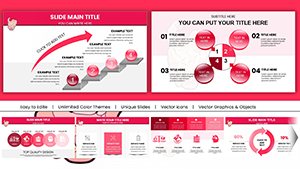
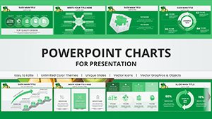
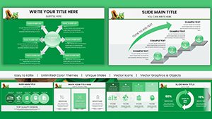
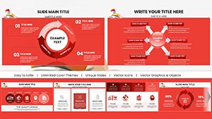
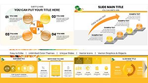
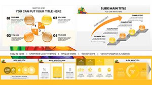
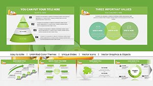
Infographic charts merge stats with storytelling in Keynote, using bars, lines, and symbols to spotlight trends in engaging formats. Journalists, data viz specialists, and presenters choose them to humanize numbers, fostering connections in info-saturated environments.
Built for Keynote`s precision, our templates offer hybrid chart types, embedded datasets, and cinematic transitions that elevate mundane metrics to memorable highlights.
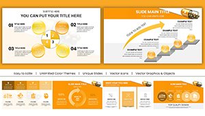
From trend forecasts to benchmark comparisons, they inform vibrantly. Discover our infographic chart array, downloadable and deployable swiftly. Chart paths to persuasion effortlessly.
Revolutionizing Data with Infographic Charts in Keynote
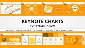
Infographic charts in Keynote infuse analytics with visuals like heat maps or radial gauges, transforming reports into riveting exhibits for growth hacking or performance audits.
They advance beyond plain plots with illustrative overlays and responsive legends, delivering insights that stick.
Curated Use Cases for Maximum Effect
Digital Marketing: Gauge engagement metrics with stylized radars.
Financial Forecasting: Layer line charts with forecast bands iconically.
Social Impact: Bar infographics for metric milestones.
Educational Insights: Scatter plots with thematic annotations.
These fuel targeted, visually potent applications.
Signature Strengths and Strategic Advice
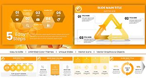
Highlights: Adaptive axes, icon integrations, and batch editing for efficiency. They optimize for exports to Keynote Theater mode.
Advice: Anchor with bold axes, vary chart styles per slide, and sequence reveals narratively. Fuse with Venns for overlap analyses, broadening appeal.
Visualize victory - get infographic charts here to master metrics.
Visionary Variations
Incorporate AR previews or pulse animations for interactivity. For startups, gamify KPIs with progress rings. Ensure alt attributes for screen readers.
Frequently Asked Questions
Encapsulating 980 words of chart wisdom, ignite your infographics. Download and dazzle with data.