Incoming Keynote Charts

Keynote`s native elegance shines through incoming charts, which elegantly depict building data flows, from opportunity pipelines to workflow progressions. These templates harness Keynote`s fluid animations to make your inflows feel alive and purposeful.

Perfect for creative professionals, startup founders, and educators on Mac, they offer intuitive tweaks that preserve the software`s aesthetic integrity. Elevate mundane metrics into mesmerizing stories that hold attention and spark dialogue.

With curved paths and soft glow effects, our incoming charts blend artistry with analysis. Peruse the lineup and unlock Keynote`s potential for dynamic data presentation.


View by: Last Added | Most Popular
  • like 3
    (221)
    Professional Development Keynote Charts: Elevate Your Growth Strategies
    ID: #KC00936
    $20.00
  • like 2
    (108)
    Principles Keynote Charts: Visualize Business Fundamentals with Flair
    ID: #KC00917
    $16.00
  • like 3
    (1065)
    Safe Period Charts for Keynote: Illuminating the Rhythms of Change
    ID: #KC00903
    $20.00
  • like 5
    (196)
    Project Cycle Steps Keynote Charts: Charting Pathways to Project Triumph
    ID: #KC00902
    $20.00
  • like 2
    (370)
    Cycles Solutions Keynote Charts: Transform Data into Compelling Narratives
    ID: #KC00901
    $20.00
  • like 4
    (1191)
    Arrows Branching Keynote Charts: Dynamic Infographics for Pros
    ID: #KC00846
    $20.00
  • like 2
    (171)
    Arrows Branching Keynote Charts: Decoding Design Decisions
    ID: #KC00839
    $18.00
  • like 2
    (344)
    3D Arrows Effective Keynote Charts Presentation
    ID: #KC00805
    $20.00
  • like 5
    (241)
    3D Arrows Keynote Charts Template
    ID: #KC00804
    $25.00
  • like 4
    (732)
    Targeting Aspects Branching Keynote Charts for Presentation
    ID: #KC00784
    $18.00
  • like 4
    (882)
    Cycle 5 Arrows Keynote Charts: Streamline Your Process Visualizations
    ID: #KC00779
    $18.00
  • like 5
    (741)
    Cycle 6 Arrows Keynote Charts: Enhance Workflow Depictions with Precision
    ID: #KC00778
    $18.00
  • like 3
    (140)
    7-Step Cycle Arrows Keynote Charts Template: Streamline Your Process Visualizations
    ID: #KC00777
    $18.00
  • like 4
    (386)
    8-Step Cycle Arrows Keynote Template: Master Complex Process Flows
    ID: #KC00776
    $18.00
  • like 2
    (196)
    9-Step Cycle Arrows Keynote Charts: Unlock Detailed Process Mastery
    ID: #KC00775
    $18.00
  • like 5
    (597)
    10-Step Cycle Arrows Keynote Template: Comprehensive Process Visualization
    ID: #KC00774
    $19.00
  • like 3
    (129)
    11-Step Cycle Arrows Keynote Charts for Dynamic Presentations
    ID: #KC00773
    $20.00
  • like 3
    (16)
    12-Step Cycle Arrows Keynote Charts: Streamline Your Process Narratives
    ID: #KC00772
    $20.00
  • like 4
    (23)
    Collection Periods Cycle Keynote Charts: Simplifying Financial Flows
    ID: #KC00760
    $22.00
  • like 4
    (604)
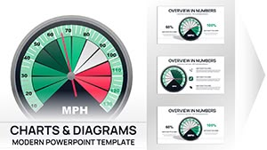
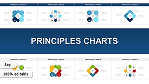
    Essential Elements Keynote Charts Template: Visual Mastery Unleashed
    ID: #KC00758
    $15.00
  • like 3
    (169)
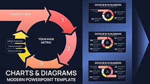
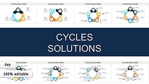
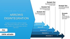
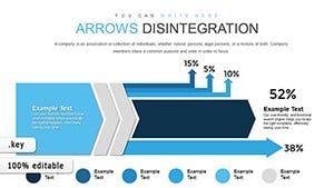
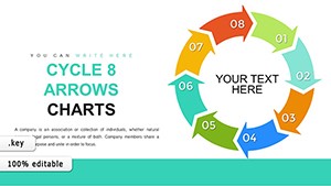
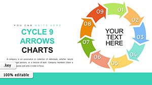
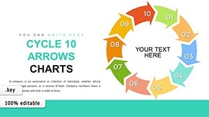
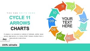
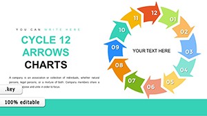
    Different and Common 3D Arrows Keynote Charts Template
    ID: #KC00755
    $18.00
  • like 4
    (222)
    Circumvolution Keynote Charts Template: Craft Captivating Visuals
    ID: #KC00700
    $12.00
  • like 3
    (166)
    4-Step Circular Keynote Charts: Master Cycle Visualizations Effortlessly
    ID: #KC00690
    $15.00
  • like 3
    (951)
    Panel Circle Segment Charts: Revolutionize Your Keynote Data Visuals
    ID: #KC00682
    $19.00


Why Incoming Charts Elevate Keynote Mastery

In Keynote, incoming charts utilize the platform`s advanced builds to unfold data layers organically, mimicking natural progression. This creates an immersive experience, contrasting with static imports from other tools that lose finesse on export.

Our designs surpass built-ins by incorporating adaptive sizing and thematic overlays, ensuring your charts harmonize with overall slide themes effortlessly.

Targeted Applications for Real-World Impact

  • Marketing Campaigns: Show content inflows driving engagement spikes, optimizing future tactics.
  • Product Development: Track feature requests entering the roadmap, prioritizing based on volume.
  • Educational Modules: Illustrate knowledge acquisition phases, from input to mastery.

These uses demonstrate the charts` role in fostering strategic clarity across domains.

Refined Techniques for Keynote Incoming Charts

Employ Keynote`s path animations to trace inflows, syncing with narration for rhythmic delivery. Balance elements with grid snapping, and layer subtle textures for depth. For multi-device viewing, optimize for iPad export to maintain animation smoothness.

Integrate with Numbers for seamless data pulls, automating refreshes for evolving datasets.

Creative Twists for Standout Presentations

Use incoming charts to narrate user journey maps in UX design shares, flowing from awareness to loyalty. In nonprofit funding pitches, depict donation streams converging on mission goals. Templates enable these narratives, infusing personality into analytics.

Vertical or diagonal orientations offer flexibility for diverse storytelling angles.

Discover Effortless Sophistication

Lightweight and Mac-optimized, these templates load swiftly and support 4K exports for high-stakes venues. Their preset builds reduce setup time, letting creativity flourish.

Seize the moment - curate your incoming charts from our collection and present with unparalleled flow.

Frequently Asked Questions