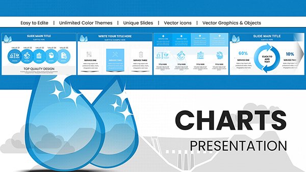
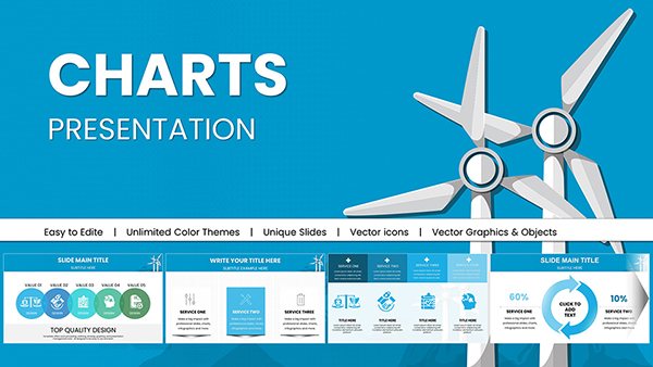
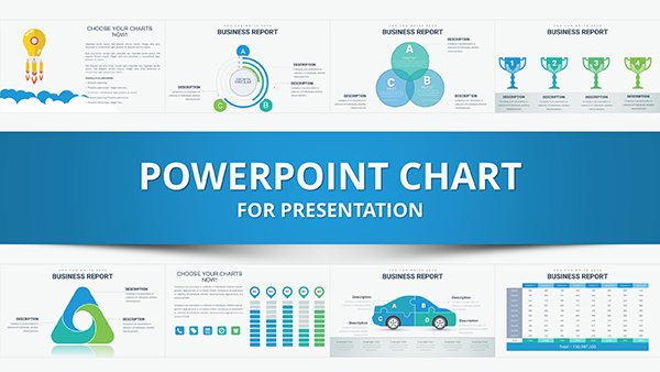
Empower your implementation efforts with our premium PowerPoint chart templates, meticulously designed to showcase data with impact. Targeted at operations leads, analysts, and presenters, these charts turn raw numbers into strategic insights, ideal for depicting growth trajectories, efficiency gains, and phase completions in project implementations.
Featuring diverse chart types like histograms for distribution analysis and combo charts for multifaceted views, our templates ensure versatility. Edit with drag-and-drop simplicity, infuse your corporate identity, and deliver presentations that captivate and convince.
Browse this category to uncover charts that match your implementation narrative. Step up your visual game and achieve measurable results.


Effective implementation hinges on transparent data portrayal, and our PowerPoint chart templates deliver just that. Crafted for clarity, a waterfall chart can dissect budget variances across implementation stages, revealing surpluses and shortfalls at a glance. This precision aids in mid-course corrections, vital for on-track deliveries.
Standard PowerPoint charts pale in comparison, often bogged down by default styling that dilutes professionalism. Ours boast refined themes, responsive grids, and export-ready formats, ensuring your visuals stand out in boardrooms or virtual forums.
Manufacturing pros deploy column charts to monitor production ramp-ups during implementations, correlating outputs with input efficiencies. In consulting, treemap charts hierarchize task priorities, streamlining client project handovers. Sales teams favor gauge charts to meter quota achievements in territory expansions.
For a digital transformation example: A Pareto chart identifies top implementation hurdles, focusing efforts on high-yield fixes and accelerating ROI.
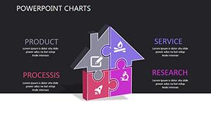
Prioritize relevance - select sunburst charts for nested implementation categories like sub-projects within initiatives. Employ consistent scales to avoid skewing perceptions, and layer tooltips for supplementary stats. Animate sparingly to underscore key shifts, enhancing the implementation`s dramatic arc.
Templates arrive with annotation guides, empowering even novices to produce expert-level outputs swiftly.
Our charts differentiate through embedded analytics, like trend forecasting lines that project implementation endpoints. This foresight turns presentations into predictive tools, impressing with proactive intelligence.
Curious to see the difference? Select and download a template to fuel your next implementation review.
Built-in PowerPoint charts require manual formatting, prone to inconsistencies, whereas ours offer one-click themes that unify your deck. Performance-wise, they load faster in large files, crucial for extensive implementation reports, and support accessibility features like alt text for inclusive viewing.
This polish translates to stronger audience connections and more persuasive implementation pitches.
Envision HR implementing wellness programs: A heatmap charts participation by department, uncovering engagement patterns for targeted boosts. In logistics, box plots analyze delivery variances, refining route implementations for peak efficiency.
Such instances underscore the templates` breadth - adapt a polar chart for circular economy implementations or a network diagram for interconnected vendor ecosystems.
Integrate PowerPoint charts into your implementation arsenal and watch clarity cascade through your teams. With robust options for every data type, these templates facilitate everything from initial scoping to final evaluations. Download today and chart a course to implementation excellence.
Explore further integrations, such as pairing charts with infographics for holistic views, or leveraging macros for automated updates. Acclaimed by industry leaders, these tools have powered countless successful rollouts, proving their worth in tangible outcomes. Embrace them to lead with data-driven assurance.
Copyright © 2009-2026 ImagineLayout All rights reserved.