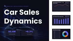
Our Ideal PowerPoint chart templates are engineered to make data accessible and persuasive, ideal for professionals turning statistics into strategic assets. Designed for consultants, managers, and researchers, they feature intuitive editing and eye-catching styles that hold attention from slide one.
Spanning histograms to funnel diagrams, these charts support Excel integration and custom animations, fitting seamlessly into any deck. Great for investor updates, performance reviews, or research overviews, they amplify your message without complexity.
Scan the options and adapt to your data story. Download now to visualize success with clarity and style.
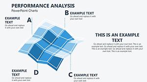
These outperform vanilla charts with smart scaling and theme harmony, enabling quick swaps between visual styles for varied audiences.
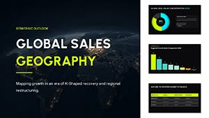
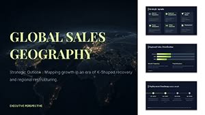
Project managers track milestones via Gantt integrations. Marketers showcase ROI with waterfall graphs. Academics illustrate hypotheses through bubble plots.
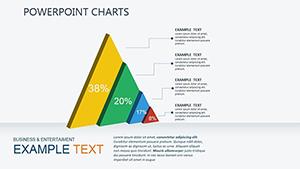
Basic PowerPoint charts lack finesse, but Ideal ones add shadows, gradients, and icons for depth.
Select formats matching data - columns for categories, scatters for relationships. Ensure axis labels are bold and legends concise. Animate series entry to guide focus sequentially.
Tip: Use 3D sparingly to avoid distortion, favoring flat designs for accuracy.
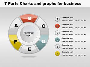
Think of an e-commerce review: Treemaps categorize product performance intuitively. For HR analytics, sunburst charts depict department structures. Such examples prove adaptability.
Link to external sources for live refreshes. Attendees report clearer understanding from these enhanced visuals.
Grab your Ideal PowerPoint charts and download today. Setup tutorials included for speed.
Excel, CSV, and direct input via PowerPoint tools.
Works with all PowerPoint animation paths.
Master slide application ensures uniform styling.
Alt text prompts and color-blind modes included.
Compressed vectors keep files lightweight.
Enhance with full deck templates. Begin your download journey!
Copyright © 2009-2026 ImagineLayout All rights reserved.