Delve into statistical elegance with histogram templates optimized for PowerPoint. These specialized charts are a boon for analysts, researchers, and educators seeking to portray frequency distributions with finesse. From survey results to quality control metrics, they provide the structure to reveal underlying patterns without complexity.
Our designs feature adjustable bins and scales, ensuring accuracy while maintaining visual appeal. Business leaders rely on them for performance breakdowns, and scientists for experimental histograms. The advantage? Quick adaptations that fit any dataset, enhancing credibility in your deliverables.
With smooth gradients and labeled axes, these templates turn mundane data into persuasive visuals. Whether for board presentations or thesis defenses, they deliver impact. Scan our assortment and select the histogram that best suits your needs right away.
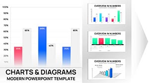
Essential Indicators PowerPoint Charts Template: Visualize Key Metrics with Precision
ID: #PC00568
$17.00
(629)
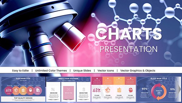
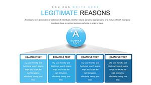
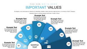
Development Concept Principles Objectives PowerPoint Charts Template
ID: #PC00554
$18.00
(899)
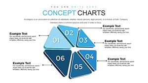
Maximize Business Development with Editable PowerPoint Charts
ID: #PC00548
$20.00
(289)
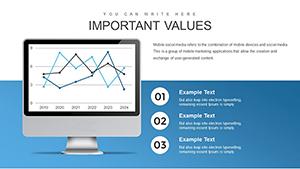
Decode PESTLE Factors with Economic PowerPoint Charts
ID: #PC00544
$15.00
(198)
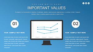
Graphs of Economic Indicators PowerPoint Charts: Navigating Architectural Financials
ID: #PC00541
$17.00
Understanding Histograms in PowerPoint Contexts
Histograms group data into bins to show density, perfect for continuous variables like time or scores. In PowerPoint, they clarify skewness or multimodality, aiding decisions in fields like manufacturing or polling.
Superior to bar charts for continuity, our templates include overlaid normals for comparisons, a feature defaults overlook. This depth supports nuanced storytelling, from sales velocity to test score clusters.
Practical Deployment Areas
Quality Assurance: Monitor defect rates across production runs.
Market Research: Analyze age demographics in consumer studies.
Healthcare: Track patient wait times for efficiency audits.
Sports Analytics: Examine scoring distributions in games.
Follow rules like equal bin widths and outlier annotations for reliability. Innovate by stacking histograms for multi-series views, contrasting subgroups vividly.
Advanced Techniques for Histogram Mastery
Utilize PowerPoint`s data links to Excel for real-time updates. Example: In inventory management, a histogram of stock levels flags reorder points, optimizing operations dynamically.
Outshining basics, ours offer customizable kernels for smoothing, ideal for noisy data. Add trendlines to forecast, enriching analytical slides.
Excited to experiment? Acquire a histogram template today for sharper insights.
Refinement Essentials
Choose bin counts via Sturges` rule for balance.
Employ log scales for skewed data.
Integrate descriptive stats in captions.
Validate with peer reviews for accuracy.
Such methods fortify your presentations against scrutiny.
Case Studies in Action
A logistics firm visualized delivery delays: Bimodal peaks revealed shift variances, spurring schedule tweaks that cut times by 15%. In education, grade histograms pinpointed curriculum gaps, guiding reforms.
For whimsy, event organizers charted attendance spikes, timing promotions astutely. Benefit: Print-ready precision for handouts.
Frequently Asked Questions
Harness histograms for data dominance. Browse and download now to illuminate your analyses.