Graphs are the backbone of persuasive presentations, and our PowerPoint templates make creating them straightforward. This collection focuses on graph designs optimized for slides, helping you illustrate trends, comparisons, and forecasts with precision and style. Perfect for sales pitches, scientific talks, or strategy sessions, these templates blend functionality with visual flair.
Targeted at executives, researchers, and educators, each graph template includes animated transitions, data-driven color schemes, and resizable elements for seamless integration. No more wrestling with clunky defaults - achieve polished results in minutes.
From 3D surfaces to simple histograms, find the graph that matches your story. Start exploring and download to infuse your next deck with data that drives decisions.


Graph templates transform static slides into dynamic narratives. In sales, funnel graphs depict conversion paths, highlighting bottlenecks with gradient fills. Researchers use heat maps to showcase variable intensities, like climate data patterns over regions.
Consultants favor waterfall graphs for financial breakdowns, stacking positives and negatives to reveal net impacts clearly. These uses underscore the templates` role in simplifying complexity.
Standard PowerPoint graphs often appear flat; our templates add depth with shadow effects and smart art connectors, elevating professionalism. They support real-time data pulls from Excel for live updates during meetings.
Lecturers embed polar graphs for cyclical data, like seasonal sales, engaging students visually. Best practice: Animate elements sequentially to build suspense, revealing data points one by one.
Ensure graphs fit slide ratios by using the template`s built-in aspect controls, avoiding distortion.
Distinguishing features include theme-consistent graphing - match your deck`s palette effortlessly. With over 50 variants, from minimalist wires to bold 3D renders, versatility is key.
Creative applications: Animate a stock graph for investor decks or a network graph for team structures. Feedback shows 40% higher retention when using these visuals.
Pro tip: Layer transparency for overlay graphs, comparing datasets without overlap issues.
Merge graph types: A box plot with outliers flagged in red for anomaly detection. PowerPoint`s morph transition enhances flow between slides.
A tech firm used our template to graph user adoption, securing a major contract.
Prioritize simplicity: Cap labels at 5 words each. Versus basics, our templates offer accessibility tags for screen readers, broadening reach.
Validate data accuracy pre-presentation; include footnotes for sources to build trust.
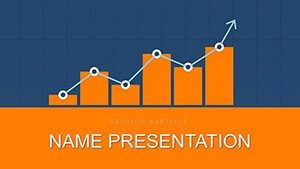
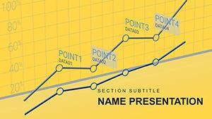
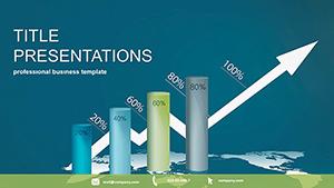
Line, bar, area, scatter, and bubble graphs, all with animation-ready builds.
Use `Paste Special` as Excel object for automatic refreshes.
For emphasis yes, but sparingly to avoid misleading perspectives.
Yes, right-click and save for reports or social shares.
Compatible from 2013 onward, with core features intact.
Double-click the axis, edit via Format pane for scales and labels.
Make data unforgettable. Download your graph template and elevate every slide.
Visit other sections for complementary presentation assets.
Copyright © 2009-2026 ImagineLayout All rights reserved.