Globe PowerPoint Diagrams
Give your presentations a worldwide perspective with our globe diagram templates. These visuals instantly communicate global reach, connectivity, and international themes.
Over 80 specialized designs include rotating globes, flat world maps, connected continents, and regional highlights - all fully editable and animation-ready.
Ideal for global companies, educators, and anyone discussing international topics in.
Add instant professionalism and visual impact to your slides.
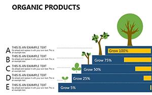
Organic Products PowerPoint Diagrams: Fueling Eco-Education
ID: #PD00197
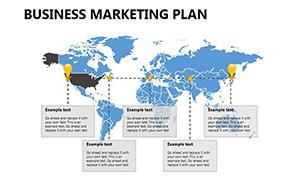
Marketing Strategy PowerPoint Template PPTX
ID: #PD00194
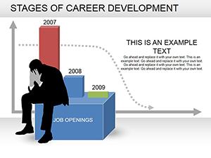
Career Development Stages PowerPoint Template | 16 Fully Editable Slides | Instant Download
ID: #PD00178
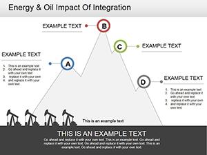
Oil Industry PowerPoint Diagram Template: Fuel Your Energy Presentations
ID: #PD00170
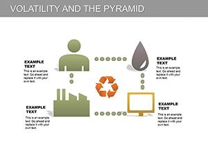
Volatility and Pyramid PowerPoint Diagrams Template
ID: #PD00114
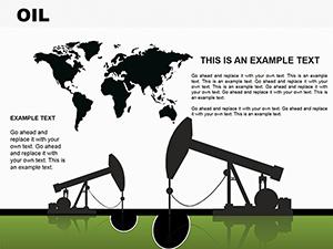
OIL PowerPoint Diagram Template
ID: #PD00097
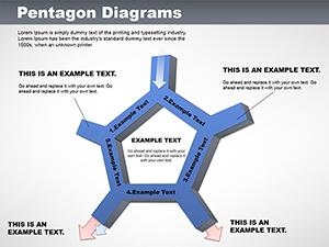
Versatile Pentagon PowerPoint Diagrams Template
ID: #PD00051
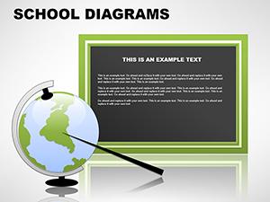
Education School PowerPoint Diagrams: Teacher Tools
ID: #PD00049
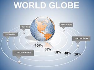
World Globe PowerPoint Diagram: Global Insights Visualized
ID: #PD00021
Marketing Plan Steps PowerPoint Diagrams
ID: #PD00009
Why Globe Diagrams Make Presentations Stand Out Globe and map visuals create immediate context for global discussions, helping audiences visualize scale and relationships across regions.
Benefits of Our Globe Templates Accurate, stylish world maps 3D globe effects and flat designs Easy region highlighting Connection lines for trade or network visuals Modern color schemes for Real-World Applications International Business: Show market expansion or supply chains.Environmental Topics: Highlight climate impact across continents.Education: Teach geography or global history.Travel & Tourism: Present destinations and routes.Design Tips for Global Diagrams Highlight specific countries with contrasting colors Use subtle animations for globe rotation Add data labels only where needed Pair with minimal text for maximum impact Bring the world to your audience - explore our globe diagram collection and download your favorites now.
Frequently Asked Questions Are the maps geographically accurate? Yes - based on standard world projections with correct country outlines.
Can I highlight specific regions? Easily - each country or continent is separately editable.
Do globe templates include 3D effects? Many feature realistic 3D globes and rotation animations.
Are they fully customizable? Yes - change colors, labels, and connections freely.
Will they work in PowerPoint? Perfectly compatible with recent versions including Microsoft 365.