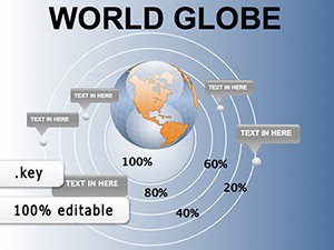
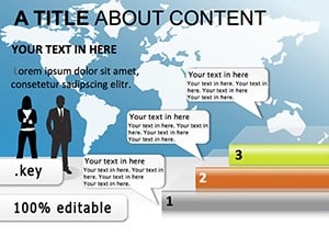
Add a worldwide perspective to your presentations with our premium globe diagram collection for Keynote. These templates help you visualize global operations, international markets, connectivity, and planetary concepts with stunning visual impact.
More than 80 elegant designs feature 3D-style globes, flat world maps, network connections, regional highlights, and animated rotations. All are fully editable and optimized for professional use.
Perfect for multinational companies, export businesses, NGOs, and educators teaching geography or global issues.

Our templates offer accurate geography, smooth gradients, layered elements, and subtle animations that basic clip art or default shapes cannot match.
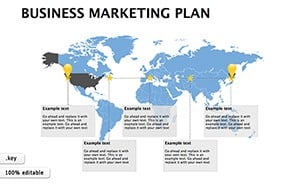
Show market presence, supply chain routes, or expansion plans across continents.
Highlight key markets, trade partners, or distribution networks.
Illustrate global environmental impact or carbon footprint data.
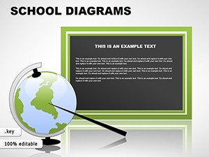
Teach continents, time zones, or global cultures with engaging visuals.
Ready to showcase your global vision? Browse our globe diagram collection now.
From realistic 3D globes and political world maps to abstract network connections, dotted flight paths, regional zoom templates, and dark-mode optimized designs.
Find the perfect global visual for your presentation - download today.
Yes - all maps use precise country borders and proportions.
Yes - individual countries are separate editable objects for easy selection.
Many feature smooth spinning or reveal animations.
Yes, both modern flat and realistic 3D styles are available.
Absolutely - templates include editable marker layers.
Copyright © 2009-2026 ImagineLayout All rights reserved.