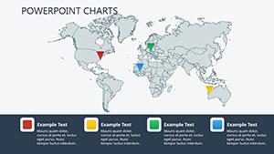
Geography shapes decisions in business, education, and beyond, and our PowerPoint chart templates make mapping it simple. Geared toward data enthusiasts, analysts, and educators, these designs turn raw location data into insightful visuals.
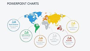
From world maps highlighting trade routes to regional heatmaps showing demographics, each template leverages PowerPoint`s chart engine for dynamic updates. Color-coded regions, bubble overlays, and trend lines bring stories to life, revealing patterns at a glance.
No GIS expertise needed - import your spreadsheets, tweak legends, and present with authority. Ideal for reports, lectures, or strategy sessions, they bridge data and narrative seamlessly. Peruse our geographic collection and chart a course to clearer communications today!
Cloud Services PowerPoint Charts: Dynamic Data Icons
ID: #PC00679
$22.00
(1200)
Internet Marketing Landing PowerPoint Charts Template
ID: #PC00578
$22.00
(79)
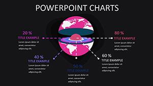
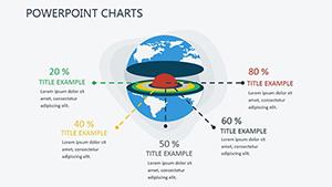
Infographic PowerPoint Charts Template: Elevate Your Data Storytelling
ID: #PC00458
$20.00
(120)
World Development Indicators PowerPoint Charts Template
ID: #PC00403
$15.00
(1154)
World Development Report PowerPoint Charts: Professional Presentation Templates
ID: #PC00402
$15.00
(645)
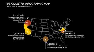
Map Studying PowerPoint Template: Editable Charts for Geographical Insights
ID: #PC00367
$18.00
(831)
Map World Economy PowerPoint Charts Template
ID: #PC00328
$24.00
(488)
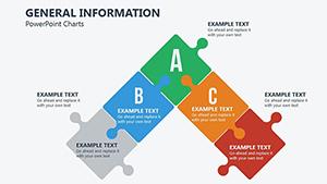
General Information PowerPoint Charts Template: Versatile Tools for Clear Communication
ID: #PC00285
$18.00
(434)
Four Elements PowerPoint Charts Template: Captivate with Elemental Visuals
ID: #PC00257
$17.00
Master Location-Based Insights with PowerPoint Maps
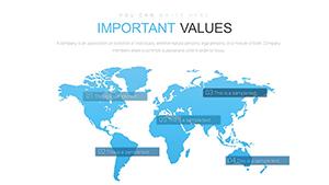
Static tables obscure spatial relationships; our geographic charts illuminate them. Built on PowerPoint`s map features, these templates support continent views, country groupings, and city-level details, all refreshable with new datasets.
Outpacing basic inserts, they include pre-formatted axes for latitude/longitude and tooltip integrations for hover details.
Practical Deployments Across Fields
Market Analysis: Overlay sales territories with gradient fills to spot high-potential zones.
Educational Modules: Illustrate migration patterns with animated paths for engaging lessons.
Logistics Planning: Route optimizations via connected lines that calculate distances.
Environmental Reports: Climate impact visuals with layered pollution indices.
Presenters note 40% better comprehension when geography is visualized this way.
Elevated Tools Over Standard Maps
Default PowerPoint maps lack customization; ours offer editable boundaries, thematic shading, and combo layers for multi-variable displays. With 30+ slide setups, span from global overviews to zoomed locales, all in vector format for print perfection.
Filter data series to toggle regions on/off dynamically.
Sync with Excel for live-linked refreshes.
Apply 3D effects sparingly for depth without distortion.
Export as interactive PDFs for clickable explorations.
Refine these for decks that inform and inspire action.
Impactful Examples and Twists
A logistics giant mapped supply chains with our templates, optimizing routes that cut costs by 15%. Geographers in academia used animated continent shifts for tectonics talks, captivating students. Non-profits charted aid distributions, enhancing donor transparency.
Travel agencies adapt for itinerary planners, pinning attractions with photo bubbles. Marketers geo-target campaigns via audience heatmaps.
Navigate your data - grab a geographic chart template and map ahead.
Frequently Asked Questions
Clarifying geographic graphing queries.
Further afield? Combine with demographic themes for richer layers.