Free PowerPoint chart templates democratize design, letting anyone create polished data visuals without breaking the bank. From startups to students, these no-cost resources level the playing field for stunning presentations.
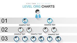
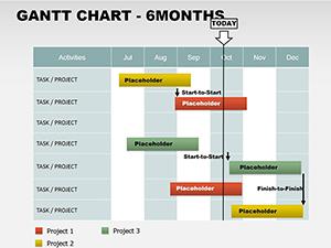
Our handpicked freebies include bar, line, and scatter charts in clean, modern styles. Easy to tweak with your figures, they feature drag-and-drop elements and theme harmony. Perfect for budget-conscious creators seeking impact without investment.
These templates prioritize simplicity and speed, with built-in formulas for auto-updates and export-ready formats. Whether budgeting a project or analyzing trends, they deliver clarity and confidence. Check out our free vault and ignite your slides today.

Free chart templates fit seamlessly into everyday needs. Freelancers chart client progress to showcase value, impressing with pro looks on a dime. Students visualize research stats for theses, earning nods from professors. Non-profits track donations via pie charts, transparently sharing mission advances.
Homeowners plot renovation costs in stacked bars, staying on track financially. Fitness enthusiasts graph workout gains, motivating consistency. Community groups map event attendance, planning future gatherings smarter.
Outshining free defaults, these templates add flair like subtle shadows and icons, without ads or watermarks. PowerPoint basics are functional but flat; ours inject vitality, improving slide flow naturally.
Key tips: Match chart types to data - lines for trends, bars for comparisons - and limit series to three for focus. Add tooltips for details on hover, enhancing interactivity.
Our free templates boast unlimited downloads, no sign-ups, and full edit rights. Compatible across versions, they include tutorials for quick mastery. Standing apart, they`re community-vetted for reliability and style.
Think of a blogger charting reader demographics - the visual pops engagement metrics alive. Or a teacher free-charting grades, simplifying parent-teacher chats.
Bonus: Integrate with Excel for live data pulls, keeping charts evergreen.
While paid options offer extras, our free ones cover 80% of needs with zero risk. They avoid bloat, focusing on core visuals that perform. Users love the no-strings access, reporting faster prep times.
Versatile for virtual or in-person, they adapt effortlessly. Download a free chart template instantly and budget-proof your brilliance.
Free doesn`t mean frills-free - these charts pack punch for every purpose. Unlock data`s potential without the price tag.
Start your free visual journey now.
Copyright © 2009-2026 ImagineLayout All rights reserved.