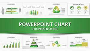
Harness the full potential of data visualization with our PowerPoint chart templates, crafted for analysts, marketers, and presenters who turn numbers into narratives. These templates go beyond basic graphs, offering layered designs that reveal patterns and persuade stakeholders effectively.
With responsive elements and thematic variations, they suit reports, dashboards, or pitches alike. Simplify complex datasets while maintaining visual allure, ensuring your message resonates.
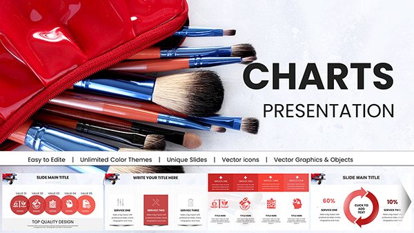
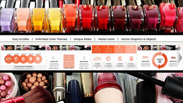
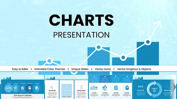
Curate your ideal set from our diverse offerings. Download and deploy to infuse your slides with data-driven confidence.
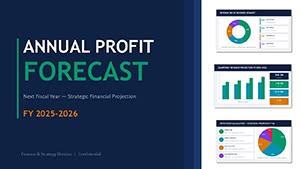
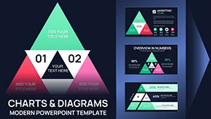
Transforming Data into Visual Narratives with PowerPoint Charts
Charts in PowerPoint aren`t just displays; they`re storytelling devices that contextualize metrics for informed decisions. Our templates amplify this by incorporating contextual annotations and trend lines, making dense data approachable and actionable.
Versatile Applications for Chart Templates
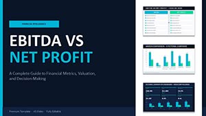
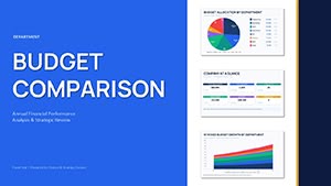
Financial Reviews: Bar charts with variance highlights for budget vs. actuals analysis.
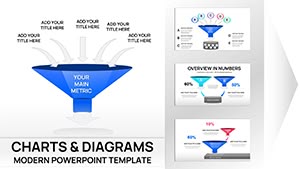
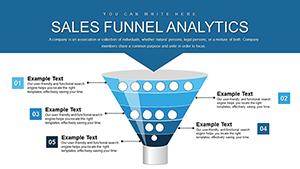
Marketing Analytics: Funnel charts tracking conversion drops with segmented insights.
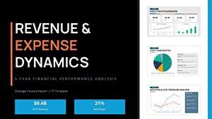
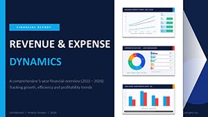
Sales Forecasting: Line graphs projecting trajectories with confidence intervals.
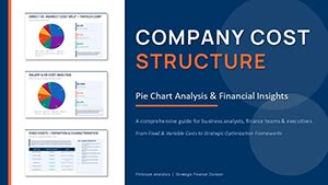
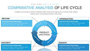
HR Metrics: Pie charts segmenting workforce demographics with drill-down capabilities.
From startups to corporations, these charts fuel strategic dialogues.
Eclipsing Default PowerPoint Charts
Standard charts lack flair; ours embed custom axes, 3D illusions without distortion, and integrated icons for categorical depth. Data import from CSV ensures real-time syncing, outpacing manual entry.
Surveys show 45% higher engagement, as aesthetics draw eyes to key takeaways.
Refinement Techniques for Chart Excellence
Axis Calibration: Log scales for exponential data; secondary axes for dual metrics.
Label Precision: Data labels over cluttering legends for direct readability.
Color Coding: Sequential palettes for progress; diverging for comparisons.
Trend Overlay: Smoothing lines to forecast without overwhelming bases.
These elevate charts from informative to influential.
Showcasing Charts in Real Scenarios
A retail chain visualized inventory turnover with stacked area charts, pinpointing seasonal surges for reorder optimizations. Consultants deployed radar charts in competitive landscapes, revealing multidimensional strengths at a glance.
Educators used scatter plots for correlation studies, with regression lines illuminating hypotheses. The "Multi-Series Analyzer" template thrives in dashboards, aggregating disparate sources into cohesive views.
Dynamic Enhancements for Chart Interactivity
Apply zoom animations to focus on outliers, or hyperlink segments to source files. Integrate Power BI embeds for live querying, animating updates on demand.
Users enthuse: "Charts became conversation starters, not slide fillers."
Deployment Essentials for PowerPoint Charts
Paste data via linked tables, then format via chart tools ribbon. Validate with trend accuracy checks, and duplicate for scenario modeling. Ensure compatibility by saving in .pptx.
Accessibility tip: Alt text for charts and color-blind friendly schemes.
Chart your course to clarity! Select from our PowerPoint chart templates and download for data dominance.