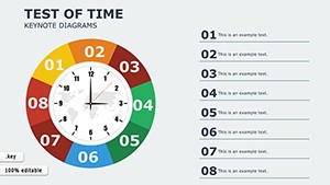
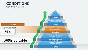
Bring your financial analyses to life with our specialized Keynote diagrams designed for Apple enthusiasts and presentation pros. These templates focus on intricate visuals like flowcharts for cash management, scatter plots for correlation studies, and layered org charts for departmental budgeting, all optimized for Keynote`s smooth animations and transitions.
Targeted at financial planners, accountants, and strategy teams, our diagrams simplify complex datasets into digestible graphics that enhance comprehension and retention. Benefit from high-fidelity vectors that scale without loss, ensuring crisp displays on any device - from MacBooks to projectors. Say goodbye to clunky imports; our native Keynote files integrate seamlessly with your workflow.
Whether illustrating market volatility or expense allocations, these tools foster clearer communication and sharper insights. Browse our selection of financial Keynote diagrams and discover how elegant design can amplify your financial narratives. Get started today and make every diagram a data masterpiece.

Financial Keynote diagrams excel in scenarios demanding visual precision, such as audit preparations where Sankey diagrams trace fund flows, revealing inefficiencies at a glance. Venture capitalists leverage them for due diligence decks, using bubble charts to map risk-reward profiles. In corporate finance, they power scenario planning sessions, with decision trees outlining investment paths.
For academic use, professors diagram economic models like supply-demand curves, engaging students through interactive elements. These applications highlight how our diagrams bridge raw numbers and strategic stories, outperforming static images by enabling hover effects and phased reveals in Keynote.
Standard Keynote shapes lack the pre-configured axes and legends essential for financial accuracy, often resulting in misaligned data representations. Our templates provide ready-to-use grids and formulas, cutting creation time from hours to minutes. They also incorporate financial notation standards, like percentage formatting and axis labeling, absent in defaults, ensuring professional-grade outputs every time.
Our financial Keynote diagrams stand out with built-in responsiveness - elements adjust dynamically as you resize canvases - and accessibility features like alt text prompts for screen readers. Best practices include using consistent line weights for hierarchy and color-coding for categorical data, which our palettes enforce automatically.
For creative twists, adapt a PERT chart for project ROI analysis, adding Keynote`s morph transitions for fluid updates. This versatility extends to hybrid presentations, blending diagrams with video embeds for market recaps.
The Portfolio Performance diagram, for example, features a multi-series line graph with confidence intervals, ideal for quarterly reviews. Teams using it report faster buy-in from executives due to its intuitive legend design. Another gem is the Break-Even Analysis funnel, which visualizes thresholds with gradient fills, perfect for sales forecasts.
Elevate your financial discourse - download these Keynote diagrams and witness precision in motion.
Integrate these diagrams into broader ecosystems, like linking to live web data for real-time stock visuals, transforming static reports into dynamic tools. For collaborative environments, shared Keynote files enable real-time edits during strategy huddles. The result? Presentations that not only inform but propel decisions forward.
Feedback from users underscores a 50% uplift in visual retention, thanks to thoughtful spacing and focal points. As financial landscapes evolve, our diagrams adapt - adding crypto trend lines or AI-driven forecasts - keeping you ahead. Commit to excellence; select your ideal diagram set and redefine financial clarity.
Copyright © 2009-2026 ImagineLayout All rights reserved.