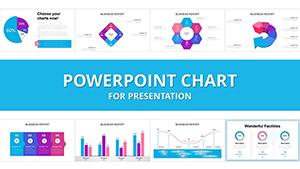
Transform raw numbers into compelling stories using our financial analysis PowerPoint chart templates. These expertly crafted visuals are designed to highlight key metrics, from revenue trends to expense breakdowns, helping you communicate insights with confidence and clarity.
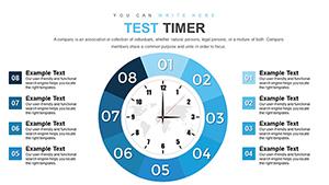
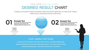
Ideal for CFOs, analysts, and business consultants, these templates offer a variety of chart types - bar graphs for comparisons, line charts for timelines, and pie charts for proportions - all optimized for financial narratives. With drag-and-drop editing, you can input your data swiftly and watch the visuals update in real-time.
Benefit from sleek, modern aesthetics that align with corporate standards, ensuring your presentations stand out in board meetings or client pitches. Our collection spans simple overviews to intricate dashboards, empowering you to tailor every slide to your specific needs. Dive in today and turn data into decisions that drive success.


PowerPoint chart templates excel in quarterly earnings reviews, where bar and column charts vividly display year-over-year growth. Investment advisors use them to illustrate portfolio performance, employing scatter plots to correlate risk and return. In budgeting workshops, stacked area charts breakdown departmental allocations, fostering transparent discussions.
Startups leverage these for pitch decks, showcasing burn rates and projections via dynamic line graphs. Auditors find value in donut charts for compliance summaries, while sales teams track KPIs with heat maps. Across industries, from banking to real estate, these tools simplify complex financial modeling for diverse audiences.
Built-in PowerPoint charts lack the polish and thematic depth of our specialized templates, often resulting in generic looks that dilute your message. Ours incorporate financial-specific icons, color schemes evoking trust (blues and greens), and pre-formatted axes for accuracy. This saves hours of manual tweaking while elevating professionalism.
Advanced features like conditional formatting and tooltips add interactivity, absent in defaults. Users appreciate the consistent grid systems for alignment, preventing cluttered slides. Ultimately, these templates bridge the gap between data and narrative, making your analysis more persuasive and actionable.
Select chart types based on data nature - avoid pies for more than five categories. Use consistent scales across slides for comparability, and incorporate legends only when necessary. For mobile viewing, opt for larger fonts and high-contrast palettes. Integrate subtle branding elements like logos in footers to reinforce identity.
Test narratives by presenting to peers, refining based on feedback. Pair charts with concise annotations to guide interpretations without overwhelming visuals. These strategies ensure your financial charts not only inform but also inspire strategic thinking.
Empower your next analysis - select from our curated charts and download instantly for immediate impact.
Unlock deeper insights with our comprehensive financial toolkit.
Copyright © 2009-2026 ImagineLayout All rights reserved.