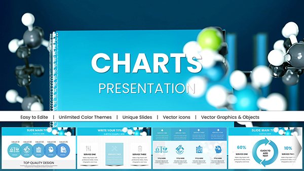
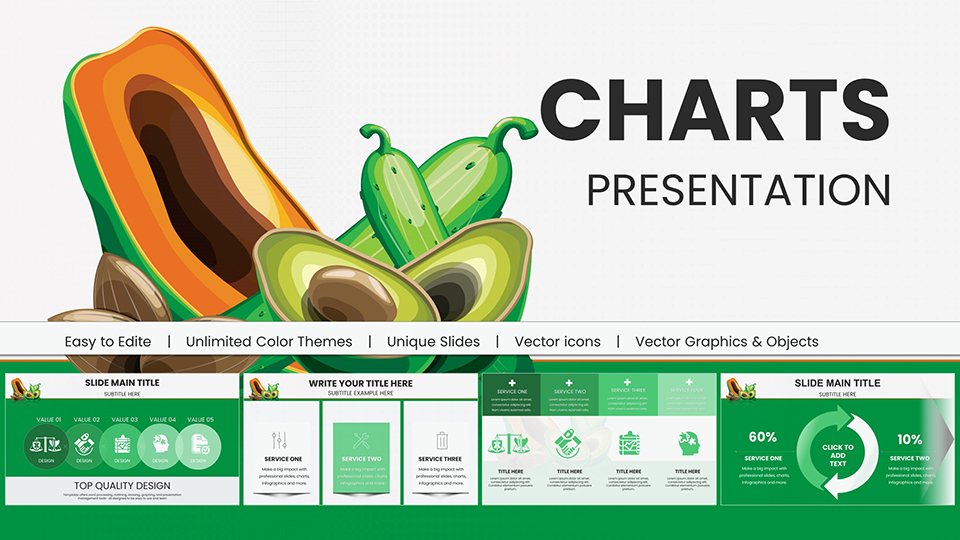
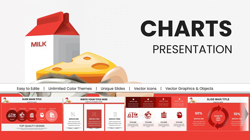
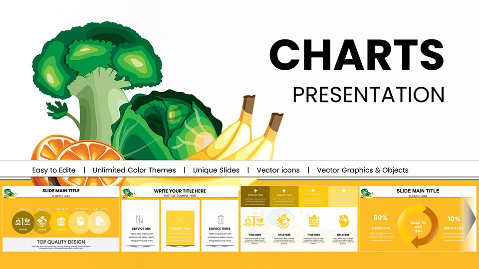
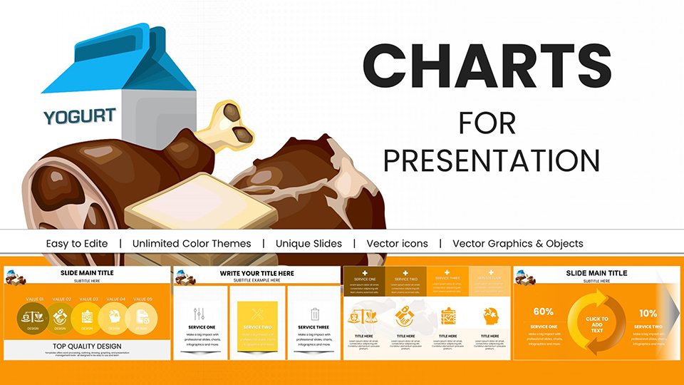
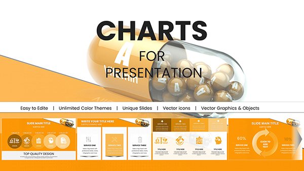
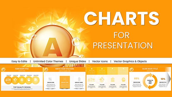
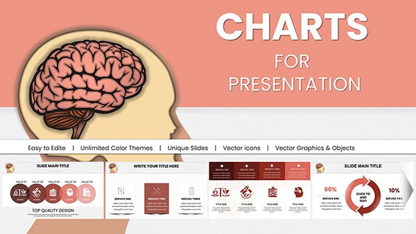
Unlock clarity in your analyses with our factors PowerPoint chart templates, designed to dissect influences like a surgeon`s scalpel. These visuals - from radial factor wheels to layered Venn diagrams - distill multifaceted data into digestible insights for strategic minds.
Business analysts map SWOT elements, while project leads weigh resource allocations in balanced scales. Tailor axes to your context: economic variables in bull`s-eye targets or environmental impacts in cascading flows, all with drag-and-drop simplicity.
Harnessing PowerPoint`s charting prowess, they animate builds to reveal interconnections progressively. Suited for boardrooms or brainstorming sessions, these templates turn abstract factors into actionable roadmaps. Peruse the options and chart your course forward.

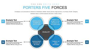
Factors PowerPoint chart templates prove indispensable in risk assessments, where finance teams plot volatility drivers in spider webs, or marketing strategists segment consumer influencers via bubble clusters. HR pros evaluate talent retention through multi-axis grids, pinpointing compensation versus culture weights.
Environmental consultants diagram sustainability levers in Sankey streams, tracing energy flows to outcome nodes. Startup pitches leverage them to frame market entry barriers as hurdle races.
Basic charts crunch numbers but obscure narratives without contextual icons like warning flags for risks. Ours embed interpretive layers, fostering deeper discussions and quicker buy-ins.
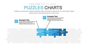
Dynamic linking to source data auto-refreshes as variables shift, eclipsing static defaults. Template galleries span 3-7 factors, scalable for nuance without clutter.
Composable segments allow stacking "Internal Factors" over "External Pressures," with color-coding conventions. Technique: Sequence reveals from core to periphery, building tension like a plot twist.
Enhance with conditional formatting - reds for threats, greens for opportunities. Opt for landscape orientation in reports, with legends positioned for glanceable reference.
Variants for domains: Legal with compliance scales, or tech with innovation funnels. Employ minimalist lines for clean vectors.
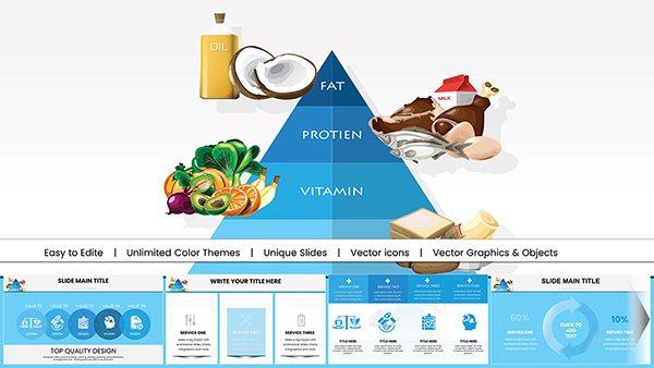
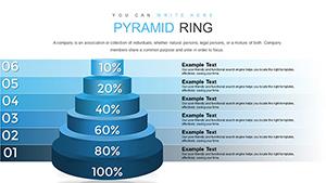
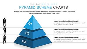
Schema selection: Pyramids for hierarchies, matrices for cross-impacts - prototype in grayscale first. Weave in annotations for storytelling depth.
Seize a factors PowerPoint chart template and illuminate your analyses today.
Empower your decisions with these charting allies. Clarity awaits - dive in.
Copyright © 2009-2026 ImagineLayout All rights reserved.