Clear financial communication starts with the right visuals. Our Expense Keynote diagram templates are designed to help you present budgets costs and financial breakdowns with confidence and clarity. Whether you are preparing a quarterly report investor pitch or internal performance review these slides transform complex numbers into structured easy to understand graphics.
Each template includes professionally arranged charts process diagrams and comparison layouts tailored for expense analysis. Simply replace the placeholder data with your own figures customize colors to match your brand and deliver a polished presentation in minutes. From cost distribution and operational spending to project based budgeting these diagrams help you explain where money goes and why it matters.

Financial data can quickly overwhelm an audience if it is presented as plain tables or dense spreadsheets. Expense Keynote diagrams transform raw numbers into structured visual stories. With organized layouts pie charts bar comparisons and segmented breakdowns you can clearly demonstrate spending patterns highlight savings opportunities and justify budget decisions.
These templates are created for professionals who need precision and speed. Instead of building slides from scratch you start with ready to use visual frameworks designed specifically for expense reporting and financial analysis.
Expense focused presentations are essential across industries. These templates are ideal for:
By using visual diagrams instead of plain spreadsheets you keep your audience focused on insights rather than calculations.
Standard Keynote themes provide basic charts but they rarely offer structured storytelling for financial presentations. Our expense templates provide:
Instead of adjusting generic slides you work with layouts created to support financial communication from the start.
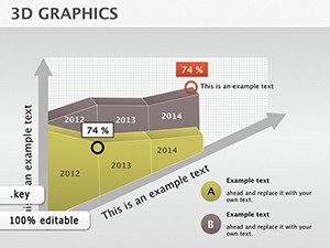
Show how expenses evolved over time. Compare planned vs actual spending. Highlight categories that exceeded projections. Visual diagrams make trends immediately visible.
Demonstrate capital allocation product development costs marketing spend and operational runway. Clean structured diagrams build trust and show financial discipline.
Break down staffing tools logistics and overhead costs. Use segmented diagrams to clarify how funds are distributed and where optimizations can be made.
Teach budgeting principles expense categorization and cost control strategies. Visual examples help learners grasp financial concepts faster.
Remember that your goal is not to show every number but to explain what the numbers mean. Well designed diagrams guide the audience toward conclusions naturally.
All slides are designed for Apple Keynote and include editable vector shapes charts and text blocks. Adjust fonts colors and layouts to match your corporate style. Insert your own financial data and adapt diagrams to monthly quarterly or annual reporting needs.
Choose a professional expense Keynote diagram template today and simplify the way you present financial information. Clear visuals lead to confident decisions. Download now and upgrade your next budget presentation.
Yes all expense diagram templates are fully compatible with current Apple Keynote versions and support easy editing on Mac devices.
Absolutely. Every diagram is fully editable. You can change colors labels icons and data values to match your branding and financial structure.
Yes. The layouts are designed for professional business settings including board meetings investor pitches and executive reviews.
No design experience is required. Simply replace placeholder text and adjust chart data using built in Keynote tools.
Copyright © 2009-2026 ImagineLayout All rights reserved.