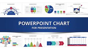
Explore our collection of professional PowerPoint chart examples designed to bring your data to life. Perfect for managers educators and marketing teams
Visualize trends distributions and hierarchies effectively with charts ready for customization and presentation
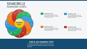
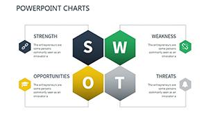
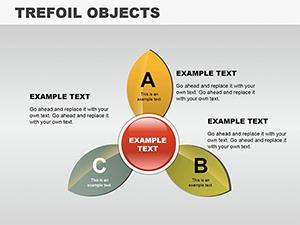
Trefoil Objects PowerPoint Charts Template: Unique Data Shapes for Impact
ID: #PC00112
$20.00
Why Use PowerPoint Chart Examples
Our chart examples combine clarity and style making data interpretation easier and presentations more compelling. Unlike standard templates these charts are fully editable and versatile
Real-World Use Cases
Business Analysis: Visualize budgets forecasts and KPIs clearly
Marketing: Showcase campaign data and trends effectively
Education: Present student progress and research insights
Benefits Over Default Templates
Editable layers for quick customization
Professional design enhances engagement
Supports complex data visualizations with ease
Creative Tips and Best Practices
Select chart types based on data clarity
Use color coding to highlight trends
Integrate with Excel for live data updates
Start presenting data confidently with our ready-to-use chart examples
Frequently Asked Questions
Can I edit these chart examples easily?
Yes all chart examples are fully editable so you can adjust colors shapes and text to fit your needs.
Are these charts suitable for business presentations?
Absolutely they are perfect for visualizing business data and KPIs in meetings or reports.
Can educators use these charts for teaching?
Yes these charts are excellent for presenting research findings and tracking student progress.
Do I need advanced PowerPoint skills to use these charts?
No they are designed for all skill levels with editable layouts that are easy to customize.
Can these charts integrate with live Excel data?
Yes you can link charts to Excel for live updates and dynamic presentations.