When your presentation requires clarity and confident conclusions, structured visuals make all the difference. Our Keynote evaluation diagrams help you compare options, assess performance, and present results in a logical and persuasive format. Whether you are analyzing business strategies, reviewing academic research, or measuring marketing campaigns, these layouts turn complex thinking into easy to understand visuals.
Each template is fully editable in Apple Keynote and designed for professional environments. Clean typography, balanced layouts, and clear data zones ensure that your audience quickly understands what matters most. Instead of building evaluation charts from scratch, you can focus on your insights while the design supports your message.

Evaluation is at the heart of every strong presentation. From performance reviews to project comparisons, audiences expect structured logic and measurable results. These Keynote evaluation diagrams are created to present scores, criteria, rankings, and analytical summaries in a clear visual hierarchy.
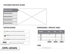
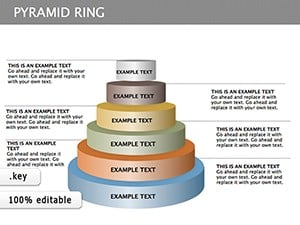
Instead of default slides with basic bullet points, you get professionally aligned graphics, comparison grids, rating scales, and multi criteria frameworks. Each slide is organized to guide the viewer from criteria to conclusion without confusion.
For corporate teams these diagrams simplify board level reporting. For educators they clarify grading logic. For consultants they strengthen credibility with structured visuals that show objective thinking.
Standard Keynote layouts are often too generic for analytical presentations. They lack structured rating systems and comparison blocks. Our templates are designed specifically for evaluation scenarios.
The result is a presentation that looks intentional and well structured rather than improvised. Your message becomes easier to follow and more persuasive.
To make the most of your evaluation diagrams keep your criteria limited to key indicators. Too many factors can overwhelm the audience. Use consistent scoring systems across slides and highlight final conclusions with subtle contrast or emphasis.
When presenting comparisons consider grouping criteria into categories such as cost quality performance and risk. This structure helps stakeholders quickly interpret results.
You can also animate elements step by step in Keynote to reveal scores progressively. This technique keeps attention focused and builds narrative tension before the final summary.
All diagrams are fully customizable. Change colors to match your brand adjust icons replace text and resize elements without losing quality. The layouts are optimized for widescreen displays and professional projection environments.
Whether you are preparing a strategic business report or an academic defense, these templates help you communicate evaluation results with authority. Explore the collection and choose a layout that aligns with your presentation style.
Start using ready made evaluation diagrams today and transform your analysis into a confident visual story.
Yes all elements including text shapes charts and colors are fully editable in Apple Keynote so you can adapt them to your project needs.
Absolutely the layouts are designed for professional business environments including board meetings performance reviews and strategic planning sessions.
Yes they are ideal for research evaluation thesis defense grading systems and analytical comparisons in educational settings.
Yes all slides are optimized for modern widescreen displays ensuring clean alignment and professional projection quality.
Copyright © 2009-2026 ImagineLayout All rights reserved.