In Keynote, effect charts bring cause-and-effect relationships to life with elegant animations and fluid designs tailored for Apple`s ecosystem. These visuals are perfect for dissecting processes, from strategic planning to creative brainstorming, ensuring your message lands with precision.
Aimed at designers, educators, and executives who value seamless integration with macOS, our templates offer effortless editing and high-fidelity rendering on Retina displays. They transform dense information into engaging narratives, keeping viewers hooked from slide one.
With options like cascading effect lines and interactive nodes, you`ll craft presentations that feel innovative and professional. Dive into our effect chart collection today and harness Keynote`s power for unforgettable impact.

Effect charts in Keynote leverage the software`s smooth transitions to illustrate how one element influences another, creating a narrative arc that`s both informative and captivating. Unlike rigid alternatives, our templates use vector graphics for crisp scalability and embeddable hyperlinks for deeper dives during live sessions.
Standard Keynote charts can lack the depth for nuanced relationships; our versions add layered transparency and shadow effects, adding dimension without complexity. This results in slides that not only inform but also inspire action.
Such scenarios showcase the adaptability of effect charts, turning Keynote into a storytelling powerhouse.
Start with Keynote`s build-in tools to sequence chart elements, revealing causes before effects for dramatic emphasis. Use the color wheel for harmonious palettes that reflect your theme, and incorporate Magic Move for seamless shifts between slides. Keep text minimal - let the chart`s structure speak, supplemented by voiceover cues.
For accessibility, add alt text to shapes and ensure high contrast ratios, aligning with inclusive design principles.
Consider an effect chart for product feedback loops in a design review, showing iterations based on user input. In environmental talks, trace pollution sources to health impacts, using Keynote`s 3D rotations for immersive views. Our templates support these twists, encouraging fresh approaches to data display.
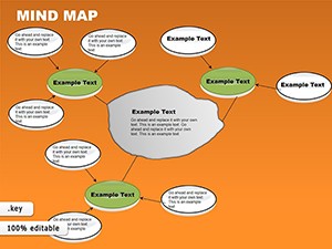
From spiral effect patterns to branched decision trees, variety keeps your presentations fresh and forward-thinking.
These Keynote-ready effect charts are optimized for quick exports to video or PDF, preserving animations for sharing. Their lightweight files won`t bog down your Mac, and one-click theme syncing ensures brand consistency across decks.
Transform ideas into visuals that command attention - select your favorites from our library and present with poise.
Copyright © 2009-2026 ImagineLayout All rights reserved.