Navigate the complexities of global economies with our Economy Keynote diagrams. These sophisticated visuals break down intricate data into digestible formats, empowering economists, policymakers, and academics to communicate findings with precision and persuasion.
From supply-demand curves to GDP infographics, each diagram is engineered for clarity, using clean lines, intuitive icons, and adaptive color schemes that highlight key metrics. Targeted at business strategists forecasting market shifts or teachers explaining fiscal policies, these tools enhance comprehension and drive informed discussions.
Experience the advantage of interactive elements that allow real-time data tweaks, ensuring your presentations remain current and compelling. Dive into the category and select diagrams that align with your analytical needs.
Elevate your economic narratives - start downloading these essential visuals today.
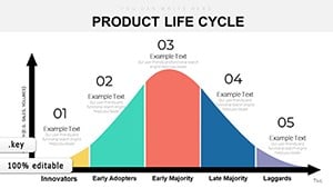

Economy Keynote diagrams are indispensable for dissecting financial landscapes. In boardrooms, executives deploy cycle flowcharts to strategize recoveries, tracing inflation paths with arrow overlays. Academic settings benefit from pyramid structures illustrating wealth distribution, fostering debates on inequality.
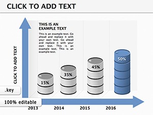
Government advisors visualize policy impacts via bar comparisons, projecting outcomes post-reform. Consultants craft client reports with honeycomb modules segmenting sector contributions, revealing growth hotspots.
Standard Keynote shapes often result in cluttered, unengaging visuals that obscure insights. Our Economy diagrams employ minimalist aesthetics with smart grouping, reducing cognitive load and amplifying retention - studies show visual clarity boosts understanding by 65%.
Unlike rigid defaults, these support layered animations revealing data progressions, like expanding bubbles for economic expansions. Vector precision ensures crisp exports to reports or web, far surpassing raster-based alternatives prone to distortion.
Built-in accessibility via ARIA labels and scalable fonts makes them suitable for diverse audiences, from print to large-format displays.
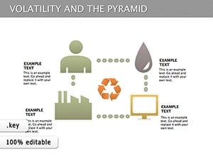
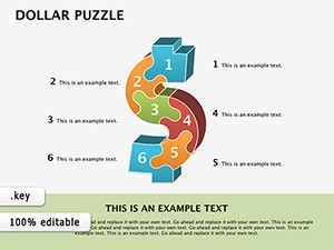
Consider a fintech startup`s funding deck: A dollar puzzle assembles revenue streams, animating pieces to fit during growth projections. In a university lecture, volatility pyramids stack risk layers, peeling back to expose mitigation strategies.
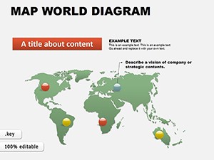
For global trade seminars, world maps overlay tariff flows, with zoom-ins on hotspots like EU-China relations. Innovate by combining with AR filters for app demos, where users manipulate 3D economic models on mobile.
Transform data into stories - download an Economy diagram now and illuminate your analysis.
They feature expandable sections and filtering tools, allowing seamless integration of thousands of data points without overwhelming the viewer.
Yes, adjust timings and triggers via Keynote`s timeline, syncing with narration for controlled reveals.
Absolutely - use built-in connectors to pull charts, updating dynamically with spreadsheet changes.
Exportable to PPTX for cross-platform use, preserving most interactive features.
Vector text fields accommodate any language, with font suggestions for global readability.
Copyright © 2009-2026 ImagineLayout All rights reserved.