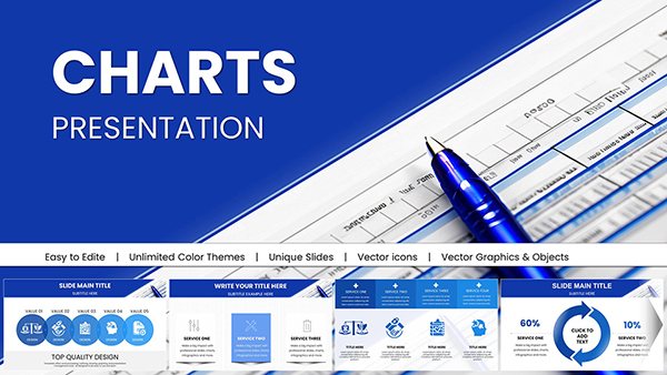
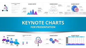
Dive into our selection of financial charts designed exclusively for Keynote, tailored to economics and financial themes. These templates empower you to visualize intricate data like currency fluctuations, investment returns, and economic indicators with elegance and precision.
Aimed at financial advisors, market researchers, and university lecturers, these charts go beyond standard visuals by incorporating Apple-native animations and responsive layouts that shine on Mac devices. Whether charting stock portfolios or sectoral growth, you`ll find tools that make complex information digestible and persuasive.
From radial gauges for risk assessment to stacked areas for budget breakdowns, our collection supports diverse needs. Browse now to discover how these Keynote-ready charts can enhance your storytelling, turning numbers into narratives that resonate.
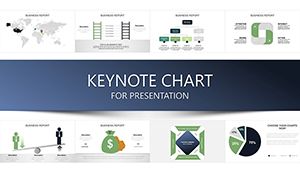


Keynote`s fluid interface pairs perfectly with our chart templates, offering smoother transitions and higher fidelity renders than cross-platform alternatives. These designs tackle financial jargon overload by using intuitive icons - think dollar signs morphing into trend arrows - for instant comprehension.
For economists dissecting GDP components or financiers modeling cash flows, the templates include layered vectors that scale without distortion, ideal for high-res exports.
Versus generic charts, ours embed economic context - like axis labels in currency units - reducing setup errors. Pro tip: Leverage Keynote`s build effects to reveal data points sequentially, building suspense in your reveals.
Adapt a forex volatility chart for crypto presentations by recoloring to neon tones, appealing to younger investors. Or, for sustainability reports, overlay environmental metrics on economic growth bars to underscore green finance.
Best practices emphasize balance: Limit to 3-5 data series per chart to avoid clutter, and always include source footnotes for credibility.
These templates support dark mode seamlessly, ensuring visibility in varied lighting. Experiment with 3D rotations for volumetric data like debt pyramids, adding depth without gimmicks.
The "Economic Dashboard Pro" boasts 40+ chart variations, from heatmaps for regional disparities to funnels for capital flows - users love its drag-and-drop simplicity for last-minute tweaks.
"Investment Horizon Tracker" excels with Gantt-style timelines for project ROI, praised for clarifying long-term strategies in advisory meetings.
For macro fans, "Inflation Dynamics" offers customizable Sankey diagrams tracing price pass-throughs, bridging theory to real-world policy.
Overly dense spreadsheets? Convert them via our import-friendly placeholders. Narrative flow is key - frame charts as chapters in your economic story, from setup to resolution.
Ensure inclusivity with color-blind friendly palettes and descriptive titles. Grab your favorite chart set now and refine your visual edge.
Addressing your top concerns about financial charting in Keynote.
Need more details? Reach out to us anytime.
Copyright © 2009-2026 ImagineLayout All rights reserved.