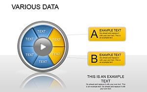
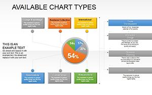
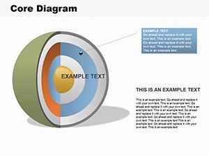
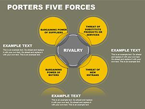
Elevate your economic presentations with our curated PowerPoint diagrams focused on economic concepts. From flowcharts mapping supply chains to Venn diagrams overlapping market segments, these templates distill intricate ideas into digestible visuals.
Targeted at consultants, researchers, and executives, they streamline communication of fiscal policies, trade dynamics, and growth models. Benefit from time-saving features like auto-updating links to Excel data, ensuring accuracy without manual redraws.
Dive into the gallery below to select diagrams that align with your narrative. Customize effortlessly and deliver presentations that resonate and drive decisions.
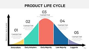


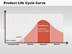
PowerPoint diagrams shine in scenarios requiring clear visualization of economic relationships. In corporate strategy sessions, use process diagrams to outline budgeting workflows. Academics employ cycle diagrams for explaining business cycles, from expansion to recession phases.
Government analysts might opt for hierarchy diagrams to depict organizational structures in economic agencies. Startups can utilize mind maps for brainstorming investment opportunities in volatile markets. These versatile tools adapt to any economic discourse, enhancing retention and engagement.
For strategic planning, timeline diagrams track economic milestones, like policy implementations over decades, with milestones marked by icons for quick scanning.
Researchers favor fishbone diagrams to pinpoint causes of economic downturns, categorizing factors like inflation drivers or trade barriers visually.
Standard PowerPoint shapes lack the sophistication our economic diagrams provide, such as layered transparency for overlapping data sets or embedded formulas for real-time calculations. This results in 50% more efficient updates compared to from-scratch builds.
Designed with economic precision in mind, they incorporate scales for logarithmic views of exponential growth and color-blind friendly palettes. Cross-platform compatibility ensures flawless rendering on Windows or Mac.
Applying these elevates your diagrams from informative to influential, shaping economic conversations effectively.
Envision a CFO using a waterfall diagram to cascade revenue streams into net profit, revealing tax impacts at each step. Or an economist with a pyramid diagram layering economic classes, illustrating wealth distribution disparities.
Our spotlight template: A network diagram connecting global trade nodes, with thickness denoting volume - animate edges to simulate flows, mesmerizing viewers. Another: A gear diagram interlinking inflation, interest rates, and employment, rotating to show interdependencies.
Pair with PowerPoint`s morph transitions for fluid evolutions, like expanding a basic org chart into a full economic ecosystem. Download today and innovate your visual strategy.
Peruse our economic PowerPoint diagrams and secure the ones that fit your project. Transform data into diagrams that deliver results.
Copyright © 2009-2026 ImagineLayout All rights reserved.