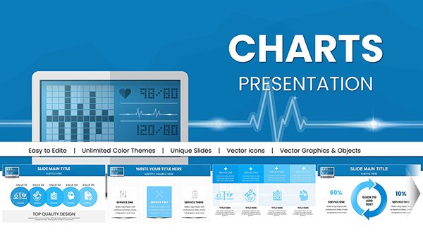
Harness the power of visuals in economic storytelling with our PowerPoint chart templates, optimized for depicting fiscal trends, sectoral performances, and predictive models. Suited for analysts, executives, and educators, these include radar charts for balanced scorecards and funnel diagrams for economic flows.
Transform spreadsheets into slide-ready masterpieces with color gradients for growth phases and icons for qualitative factors. Animate sequences to unfold market dynamics, captivating audiences during strategy sessions or lectures.
Leveraging PowerPoint`s charting prowess, these templates facilitate quick updates and exports. Ideal for quarterly reviews or thesis defenses, they blend aesthetics with analytics. Select from our curated charts and deliver data with distinction.
Raw economic data intimidates; our templates demystify it via sophisticated yet simple charts, outperforming standard PowerPoint tools with economic presets like CPI indices or Lorenz curves. This efficiency translates to more time for interpretation, less for design.
Users commend their ability to make intricate analyses approachable and actionable.
Use Cases Across Economic Domains
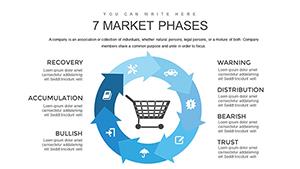
Strategic Planning: Visualize SWOT with quadrant charts for opportunity mapping.
Performance Metrics: Dashboard-style slides aggregating KPIs like ROI and EBITDA.
Educational Seminars: Step-through animations for supply-demand equilibria.
Risk Assessments: Tornado charts for sensitivity to variables like interest rates.
Applicable in consulting, finance, and policy-making for informed discourse.
Superiority Over Basic PowerPoint Charts
Basic charts lack depth for economics, missing features like error bars for forecast uncertainties or sparklines for sub-trends. Ours supply these, with thematic palettes for bull/bear markets, fostering nuanced views.
Expert Tips for Chart Excellence
Choose Wisely: Match chart types to data nature, e.g., Sankey for resource flows.
Declutter: Limit labels and use legends sparingly for focus.
Dynamize: Sequence builds to guide viewer progression.
Contextualize: Pair charts with narrative bullets for depth.
These techniques amplify chart persuasiveness.
Creative Economic Chart Integrations
Innovate with geo-charts for regional disparities or timeline hybrids for historical projections. For engagement, embed quizzes on chart interpretations or VR previews of 3D models in economic simulations.
Unlock fresh perspectives on data.
Command attention with visuals - download now for economic chart mastery.
Frequently Asked Questions
Revolutionize your presentations. Get started with a download.