Illustrate economic principles vividly with our Keynote diagrams, spanning from basic bar representations to advanced Sankey flows for resource allocation. These assets integrate seamlessly, enhancing slide decks with precision and flair.
For data enthusiasts in economics, finance, and policy, they offer quick assembly with drag-and-drop ease. Scale, rotate, and animate to fit your flow.
Peruse the diagrams available and incorporate them to sharpen your economic messages. Visualize with distinction.

Diagrams clarify economic complexities across contexts. Analysts use radial diagrams for stakeholder mappings in mergers. Teachers employ tree diagrams for branching economic theories.
Planners diagram infrastructure investments as interconnected nodes. Journalists visualize election economic promises via comparative charts. Precision tools for persuasion.
Flow diagrams trace bill passages through economic impacts.
Narrative arcs with sequential diagrams unfold economic events chronologically.
Beyond Keynote`s primitives, ours feature economic calibrations like percentage axes and trend overlays. Smart guides snap elements perfectly, cutting alignment time in half.
High-fidelity rendering supports retina displays, vital for detailed economic views. Layer management simplifies complex builds.
Refine your diagrams to resonate deeply with economic audiences.
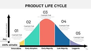
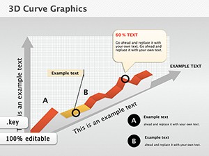
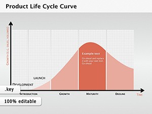
A forecaster might animate a wave diagram simulating business cycles, peaks cresting dramatically. Or a researcher stacks histograms for cross-decade comparisons.
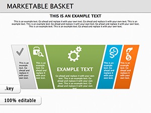
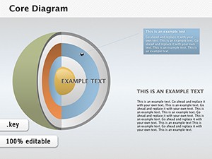
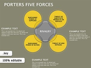
Featured: Isometric diagrams rendering 3D economic landscapes, rotatable for depth. Another: Modular puzzle pieces assembling economic models interactively.
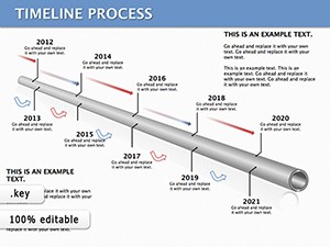
Combine with Keynote shapes for hybrid visuals, like diagram-infused timelines. Experiment boldly.
Explore economic Keynote diagrams and diagram your path to clarity. Download excellence.
Copyright © 2009-2026 ImagineLayout All rights reserved.