Eco Keynote Charts

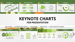
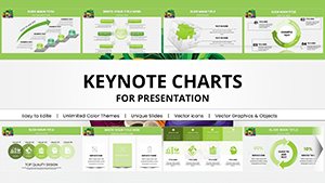
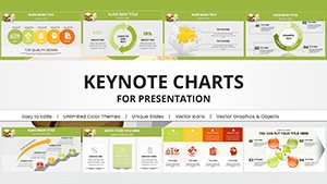
Visualize a sustainable future with our green Keynote charts, where data meets design in harmony with the environment. These templates feature fluid lines, verdant hues, and nature-derived patterns to turn numbers into narratives that inspire action.

Geared toward data analysts, environmental scientists, and green marketers, they simplify complex datasets - from emission trends to habitat metrics - into digestible, eye-catching visuals. With drag-and-drop editing, you can tailor charts to fit your storyline seamlessly.

Stand out from cluttered spreadsheets; these charts promote clarity and eco-awareness, making your Keynote presentations both informative and uplifting. Peruse our selection and elevate your data game.

Start charting sustainably - discover our eco Keynote charts today.
View by: Last Added | Most Popular
  • like 5
    (16)
    AI-Powered Robot Charts Template: Fuel Your Tech Visions with Futuristic Flair
    ID: #KC01054
    $20.00
  • like 5
    (11)
    Medical Charts Keynote Template - Editable Healthcare Infographics
    ID: #KC01045
    $20.00
  • like 2
    (165)
    Gas Prices Keynote Charts: Visualize Fuel Trends
    ID: #KC01000
    $18.00
  • like 4
    (791)
    Oil Price Keynote Charts: Forecast Energy Markets
    ID: #KC00999
    $18.00
  • like 4
    (522)
    Design Automatic Tonometer Keynote Charts Template: Illuminate Eye Health Data
    ID: #KC00978
    $18.00
  • like 3
    (445)
    Pill Pharmaceutical Medical Keynote Charts Template: Master Drug Data Storytelling
    ID: #KC00977
    $18.00
  • like 4
    (331)
    Travel-Themed Keynote Charts Template: Visualize Adventures with Style
    ID: #KC00970
    $20.00
  • like 4
    (922)
    Geothermal Energy Charts for Keynote: Illuminate Renewable Insights
    ID: #KC00969
    $20.00
  • like 5
    (1026)
    Education-Focused Keynote Charts Pack: Spark Learning with Visuals
    ID: #KC00968
    $20.00
  • like 3
    (1002)
    Eco Sustainable Keynote Charts Template: Green Visuals for a Better Tomorrow
    ID: #KC00967
    $20.00
  • like 3
    (527)
    Future Solar Energy Keynote Charts Template Presentation
    ID: #KC00966
    $20.00
  • like 5
    (944)
    Hydropower Energy Keynote Charts Template for Presentation
    ID: #KC00965
    $20.00
  • like 3
    (597)
    Powerful Wind Energy Keynote Charts Template
    ID: #KC00964
    $20.00
  • like 4.5
    (6)
    Vitamin A and Carotenoids Keynote Charts for Health
    ID: #KC00949
    $20.00
  • like 3
    (236)
    Fats and Oils Keynote Charts Template
    ID: #KC00947
    $20.00
  • like 4
    (1096)
    Healthy Food Keynote Charts Template
    ID: #KC00946
    $20.00
  • like 3
    (947)
    Vibrant Fruits Keynote Charts Template - 58 Editable Slides
    ID: #KC00945
    $20.00
  • like 5
    (13)
    Healthy Nutrition Keynote Charts Template - Inform & Inspire
    ID: #KC00944
    $20.00
  • like 3
    (105)
    Culinary Food Products Keynote Charts - Create & Captivate
    ID: #KC00943
    $20.00
  • like 3
    (730)
    Health Food Infographic Keynote Charts: Captivate Audiences with Nutritious Visuals
    ID: #KC00881
    $15.00
  • like 3
    (445)
    Infographic Healthy Eating Keynote Charts: Visualize Nutrition for Impactful Presentations
    ID: #KC00880
    $15.00
  • like 4
    (721)
    Oil Report Keynote Charts: Mastering Global Market Insights
    ID: #KC00792
    $17.00
  • like 4
    (1112)
    Energy Power Company Keynote Charts: Fuel Your Industry Presentations
    ID: #KC00750
    $25.00
  • like 5
    (938)
    Protection, Economy, Market: Keynote Charts for Economic Insights
    ID: #KC00696
    $24.00


Transforming Data with Green Keynote Charts

Green Keynote charts redefine how we present environmental data, blending analytical precision with aesthetic appeal. Unlike basic bar graphs in default tools, these incorporate organic curves and foliage accents to evoke growth and renewal, making stats on topics like deforestation rates feel alive and urgent.

Sustainability teams use them for quarterly reviews, plotting renewable adoption curves with smooth animations. Consultants craft client dashboards showing ROI on green investments, using layered pie charts that peel back like onion skins to reveal insights.

  • Core Advantages: Responsive designs that adapt to various screen sizes.
  • Engagement Boost: Colors that psychologically signal positivity and progress.

They surpass standard charts by embedding context, turning raw numbers into compelling eco-stories.

Mastering Customization in Eco Charts

Select a chart type - line for trends, scatter for correlations - and infuse it with your data. Adjust scales to highlight key thresholds, like safe emission levels, and add tooltips for deeper dives. Fonts should be crisp yet approachable, complementing the green palette.

For interactivity, link charts to live data sources if possible, or use hyperlinks for supplementary reports. Balance elements: Ensure legends are concise and icons intuitive.

  1. Theme consistency: Use earth-inspired gradients for depth.
  2. Accessibility checks: High contrast for inclusivity.
  3. Animation restraint: Gentle fades to mimic natural transitions.

Practical Use Cases in Eco Presentations

Researchers illustrate biodiversity loss with radial charts branching like tree roots, engaging conference attendees. Businesses track supply chain carbon footprints via Sankey diagrams flowing like rivers, pinpointing inefficiencies.

Educators animate water cycle charts for classroom demos, with droplets forming in real-time. Non-profits visualize donation impacts through progress rings filling with green hues.

These applications highlight how eco charts foster understanding over mere display.

Creative Twists and Pro Insights

Innovate by combining chart types - hybrid radar-line for multi-variable eco-assessments. For keynotes, sync charts with voiceover cues for seamless delivery. Tip: Export as interactive PDFs for post-presentation sharing.

Bring your data to life - grab a green chart template now.

Frequently Asked Questions