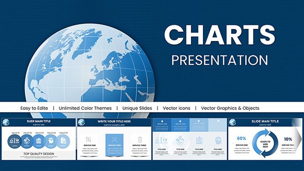
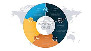
Donut charts offer a fresh twist on pie visuals, emphasizing hierarchies and breakdowns with central space for key metrics. Our PowerPoint templates harness this for analysts, presenters, and educators seeking concise data displays.
Featuring nested rings, exploded segments, and gradient fills, these charts adapt to budgets, survey results, or resource allocations effortlessly. PowerPoint`s editing tools let you adjust angles, labels, and colors for tailored insights.
Outshine crowded slides with focused designs that highlight the `hole` truth - literally. From boardrooms to classrooms, they clarify without clutter. Leaf through our donut collection and donut your way to sharper storytelling now!
Time Circles PowerPoint Charts: Visualize Trends Now
ID: #PC00659
$20.00
(801)
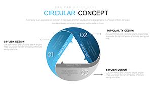
Circular Concept PowerPoint Charts - Professional Presentation Template
ID: #PC00642
$15.00
(531)
Conversion PowerPoint Charts Template: Visualize Sustainability with Ease
ID: #PC00279
$19.00
(798)
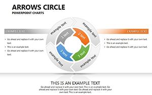
Arrows Circle PowerPoint Charts Template
ID: #PC00263
$20.00
(166)
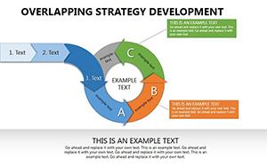
Overlapping Strategy Development PowerPoint Charts: Transform Your Decision-Making Process
ID: #PC00259
$21.00
(16)
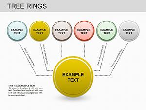
Tree Rings PowerPoint Charts Template: Layered Growth Visuals
ID: #PC00202
$18.00
(1027)
Market Research PowerPoint Charts Template | Download Now
ID: #PC00190
$22.00
(439)
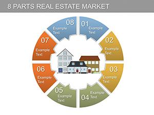
8 Parts Real Estate Market PowerPoint Charts Template: Plot Your Path to Property Success
ID: #PC00170
$24.00
(99)
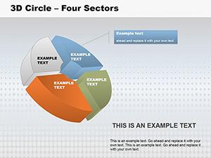
3D Circle Four Sectors PowerPoint Charts Template
ID: #PC00148
$28.00
(938)
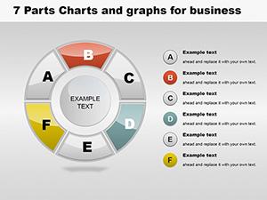
6 Parts Business PowerPoint Charts Template
ID: #PC00140
$22.00
Refine Data Display with Donut Excellence
Pie charts can overwhelm; donuts declutter by centering focal stats like totals or targets. Our templates expand this, supporting multi-series rings for layered comparisons, all auto-formatted from your data inputs.
Superior to manual drawings, they include leader lines for precise labeling and accessibility contrasts for inclusive viewing.
Core Applications in Various Contexts
Financial Overviews: Depict expense categories with inner rings for sub-breakdowns.
Project Allocations: Ring-task divisions around milestone percentages.
Health Trackers: Visualize nutrient intakes with customizable arcs.
Audiences grasp proportions 30% quicker with these intuitive forms.
Premium Edges Over Basic Charts
Basic donuts lack depth; ours provide shadow effects for dimension, sortable segments for emphasis, and theme harmony for deck-wide consistency. 25-slide packs include variants like half-donuts for timelines.
Pro tip: Link to spreadsheets for real-time updates during live sessions.
Enhancement Strategies
Explode top segments for hierarchy pops.
Pair with callouts for narrative annotations.
Animate builds from center outward for reveal drama.
Scale for mobile exports without pixelation.
Master these for charts that captivate and convince.
Vivid Use Cases and Innovations
A marketing team sliced campaign ROI into donuts, pinpointing channel winners for reallocations. Fitness coaches tracked client progress with personalized rings, motivating adherence. Non-profits portioned fund uses, building donor trust transparently.
Innovate by nesting progress meters inside for dual-metric views. Designers use for color palette breakdowns, inspiring creative briefs.
Cut to the core - select a donut template and fill it with your data.
Frequently Asked Questions
Doughnut dilemmas decoded.
Sweeten your set - explore pie complements for variety.