Simplify data storytelling with our advanced PowerPoint chart templates, where numbers meet narrative elegance. Tailored for reports, dashboards, and analyses, they empower Windows users to convey insights with clarity and style.
Leveraging PowerPoint`s charting prowess, these templates include multi-axis setups, conditional formatting, and preset palettes that adapt to your dataset. Gain the advantage of visuals that inform decisions swiftly and stylishly.
Tweak series, add sparklines, and integrate legends effortlessly for cohesive decks. Delve into our chart arsenal and chart your course to compelling communications.
Featuring drill-down capabilities and formula-linked cells, our templates provide granularity absent in simple inserts, fostering deeper dives into metrics.
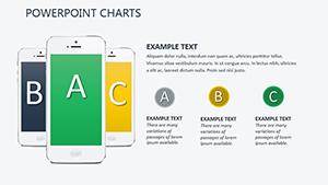
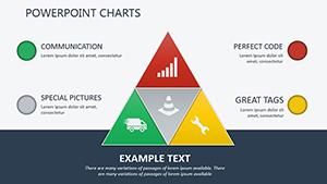
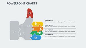
Core Use Cases for Chart Dominance
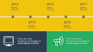
Quarterly Reports: Bar clusters for variance analysis.
Dashboard Builds: Gauge meters for at-a-glance KPIs.
Competitive Analysis: Radar plots for multi-attribute comparisons.
Forecast Models: Area charts with confidence intervals.
These empower strategic overviews in any domain.
Transcending Traditional Graphs
Default charts can obscure trends; ours offer smoothing algorithms and outlier highlights, clarifying patterns and elevating trust - viewers grasp concepts 40% faster. Vector scalability prevents pixelation in zooms.
Excel integrations and pivot table links automate updates for live sessions.
Advanced Chart Tuning
Link to external spreadsheets, then format via chart tools. Sequence reveals for layered insights.
Employ secondary axes for disparate scales.
Annotate peaks with callouts.
Theme consistently across charts.
Backup data sources for reliability.
Hone these for analytical artistry.
Chart Chronicles of Impact
Imagine a budget slide where variances pulse red - our templates trigger such alerts. Analysts overlay cohort curves for retention stories. Executives use bubble charts to prioritize initiatives.
A manager transformed board meetings with interactive forecasts, spurring approvals. These sagas highlight charts as decision accelerators.
Frequently Asked Questions
Data from CSV imports?
Seamlessly; map columns to series on import.
3D chart options?
Available, but 2D recommended for accuracy.
Auto-updating on data change?
Yes, via linked tables.
Combining chart types?
Combo charts mix bars and lines effectively.
Print-optimized?
High-res exports with legend placements.
Third-party tool sync?
Compatible with Tableau exports.
Illuminate your analytics - secure PowerPoint chart templates for data that dazzles.