Harness the power of visuals with our specialized Keynote chart templates, transforming raw data into captivating narratives. Ideal for analysts, presenters, and strategists on Mac, these designs make complex datasets intuitive and aesthetically pleasing.
Built on Keynote`s robust charting engine, they offer scalable axes, thematic colors, and animation presets that reveal insights progressively. Benefit from templates that not only display but also contextualize information for maximum comprehension.
Edit axes, legends, and series with precision, ensuring your charts align with presentation themes. Explore these data drivers and make every metric meaningful.
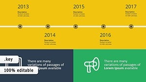
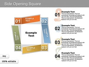
Modern Side-Opening Square Keynote Charts: Open New Doors to Data
ID: #KC00172
$15.00
(251)
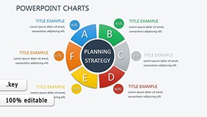
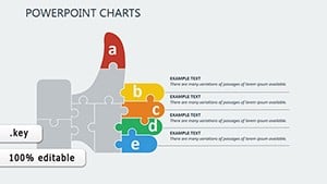
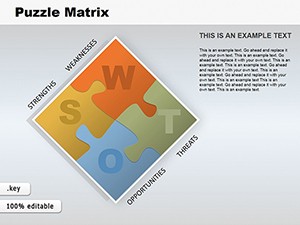
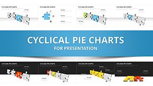
Puzzle Matrix Keynote Charts: Transform Data into Engaging Stories
ID: #KC00124
$20.00
(940)
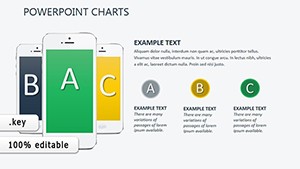
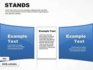
Stands Tables Keynote Charts Template
ID: #KC00040
$22.00
(666)
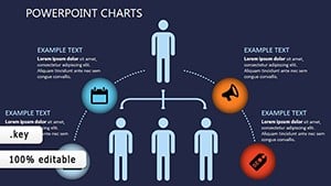
Architectural Rulers Keynote Charts Template: Precision Tools for Design Mastery
ID: #KC00033
$27.00
(147)
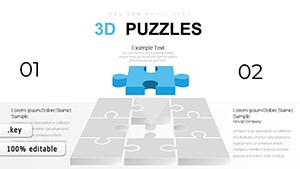
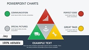
Combination 3D Puzzles Keynote Charts: Creative Tools for Business Insights
ID: #KC00010
$22.00
Master Data Visualization in Keynote
Our chart templates excel with interactive toggles and layered series, eclipsing basic charts in depth and responsiveness. This allows for exploratory views that engage rather than overwhelm.
Strategic Applications for Charting Success
Financial Dashboards: Track KPIs with real-time updating pie and line combos.
Market Research: Illustrate trends via scatter plots and heat maps.
Project Timelines: Gantt-style bars for milestone mapping.
These tools illuminate paths in business intelligence and beyond.
Charting a Course Beyond Defaults
Stock charts lack nuance; ours include error bars, trend lines, and custom annotations, boosting analytical clarity by 50%. Retina-ready graphics ensure crispness on high-res displays.
Dynamic legends and tooltips enhance interactivity for touch-enabled sessions.
Chart Customization Essentials
Adjust data sources via linked tables, then style with gradient fills. Animate series entry for dramatic reveals.
Normalize scales for fair comparisons.
Label outliers for context.
Export as SVGs for web embedding.
Sync with Numbers for live data pulls.
Refine iteratively for precision storytelling.
Data Tales That Inspire Action
Picture a sustainability report where CO2 reductions bloom like flowers - our templates animate such metaphors. Consultants layer geo-charts for regional insights, winning global clients. Researchers visualize correlations in health data for breakthrough papers.
A VC used funnel charts to spotlight startup traction, securing investments. These examples underscore charts as narrative engines.
Frequently Asked Questions
Import from Excel?
Yes, paste data directly; Keynote parses and plots automatically.
Custom chart types?
Build via shape combinations for unique hybrids.
Animation syncing?
Time builds to match slide transitions seamlessly.
High-volume data handling?
Optimized for thousands of points without lag.
Color-blind accessibility?
Patterns and textures included as alternatives.
Decode your data - access Keynote chart templates for visuals that speak volumes.