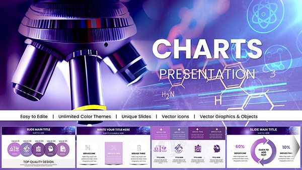
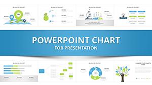
Elevate your presentations with PowerPoint chart templates designed for clarity engagement and professional impact.
Our collection features over 100 fully editable templates including bar line pie and scatter charts suitable for marketing campaigns business reports educational lectures and financial analysis. Pre-built animations and color schemes help you convey insights effectively while saving hours on formatting.
Default charts often lack visual appeal and engagement. Our templates provide ready-to-use layouts animations and design consistency across your slides.
Real-World Use Cases
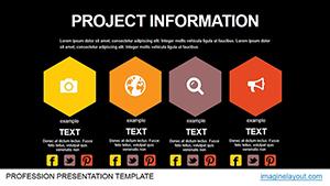
Business Reports: Dashboard and KPI presentations.
Education: Visual aids for lectures and student comprehension.
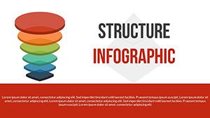
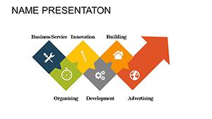
Marketing: Infographic-style charts for campaigns and social media.
Financial Analysis: Waterfall and Gantt charts for projections and variances.
Benefits vs Default Charts
These templates save time offer thematic consistency across slides and include pre-set animations to guide the audience seamlessly.
Creative Tips & Best Practices
Use 5-7 data points per chart for readability.
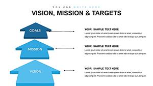
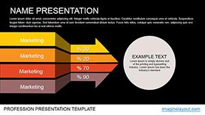
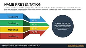
Match chart types to your message such as stacked bars for compositions.
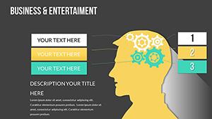
Integrate icons or subtle 3D effects for emphasis.
Combine multiple templates for comprehensive decks and download today to transform your presentations.
FAQs
What chart types are included?
Bar line pie scatter radar and more all fully editable and animatable.
Are templates compatible with older PowerPoint versions?
Yes compatible with PowerPoint 2016 and later with core features backward-compatible.
Can I import my own data?
Yes copy-paste or link Excel data for live updates.
Can I customize colors and fonts?
Yes all elements are fully editable to match branding.
Do templates support animations?
Yes pre-set entrances and emphasis animations included and editable.