Transform complex numbers into clear actionable insights with our 2026 PowerPoint data diagram templates. Perfect for professionals who need to present metrics, trends, and relationships with precision and style.
Save time and enhance clarity with ready-to-use templates designed for business, education, and marketing presentations.
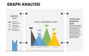
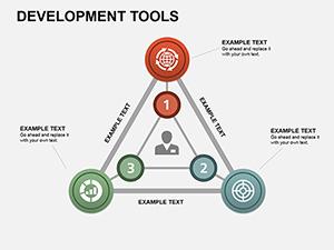
Development Tools PowerPoint Diagrams: Streamline Your Project Visions
ID: #PD00153
$18.00
(845)
Database Tables PowerPoint Diagram Template
ID: #PD00130
$20.00
(426)
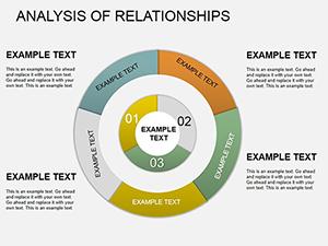
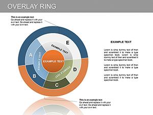
Overlay Ring PowerPoint Diagram
ID: #PD00125
$20.00
(511)
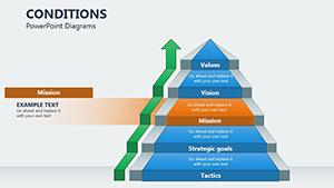
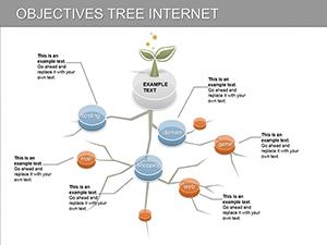
Dynamic Objectives Tree PowerPoint Diagrams: Elevate Your Presentations
ID: #PD00113
$20.00
(23)
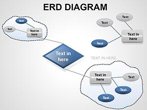
ERD PowerPoint Diagrams - Fully Editable PPTX
ID: #PD00018
$16.00
(1118)
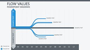
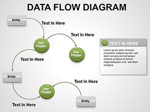
Data Flow PowerPoint Diagrams Template
ID: #PD00017
$22.00
Why Choose PowerPoint Data Diagrams
PowerPoint data diagrams elevate your presentations by turning raw data into compelling visuals. Unlike standard charts, these diagrams show relationships, patterns, and flows, making complex information easy to understand.
Real-World Use Cases
Business Reports: Visualize quarterly performance and sales funnels
Education: Explain complex processes and statistical results
Marketing: Map customer journeys and campaign flows
Healthcare: Track patient outcomes and treatment paths
Benefits Over Default Templates
Dynamic Updates: Link with Excel for real-time data refresh
Enhanced Readability: Clear shapes and annotations highlight key insights
Professional Appeal: Ready-to-use, polished designs save preparation time
Creative Tips and Best Practices
Use color semantics consistently for positive and negative metrics
Embed footnotes to validate data sources
Include drill-down layers for detailed views
Explore our templates to find the perfect design for your data and elevate your presentations today.
Frequently Asked Questions
Can I edit the templates in PowerPoint directly?
Yes, all templates are fully editable in PowerPoint. You can adjust text, colors, and data visuals to suit your needs.
Are these templates compatible with Excel data?
Yes, many diagrams can be linked to Excel to automatically update charts and flows with your latest data.
What industries are these diagrams best for?
They are ideal for business, marketing, education, healthcare, and research presentations that require clear visualization of data flows and relationships.
Do templates include interactive features?
Some templates include interactive elements like hover effects and clickable links to enhance presentations.