Step up your data presentation game with our PowerPoint chart templates, designed to turn spreadsheets into stunning visuals that inform and persuade. These templates cover every chart type, optimized for clarity and customization.
Analysts, marketers, and educators rely on them to highlight trends, comparisons, and forecasts without the hassle of manual design. With built-in formulas and styling presets, integrating data is a breeze, whether from simple lists or complex queries.
Each template ensures mobile-friendly rendering and theme harmony, perfect for hybrid meetings or printed handouts. Focus on insights, not aesthetics - our charts handle the rest.
Scan our library now and find the chart that best captures your story, ready to download and deploy.
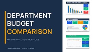
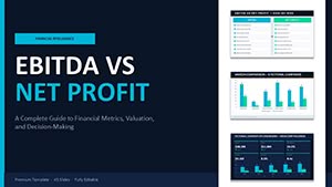
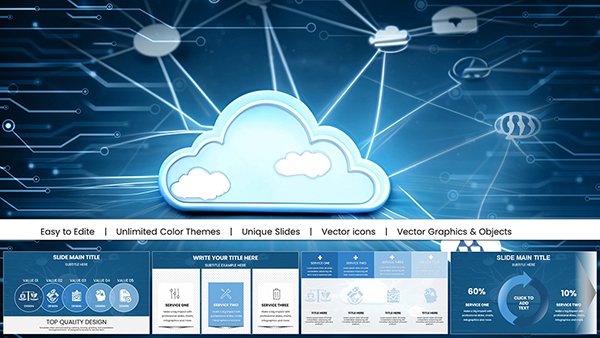
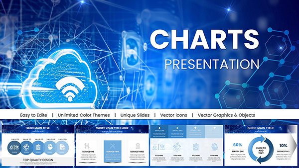
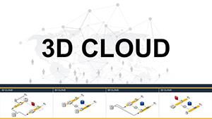
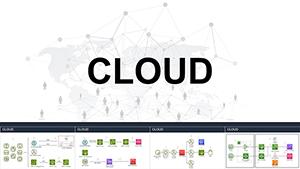
Essential Indicators PowerPoint Charts Template: Visualize Key Metrics with Precision
ID: #PC00568
$17.00
Elevating Presentations with Chart Templates
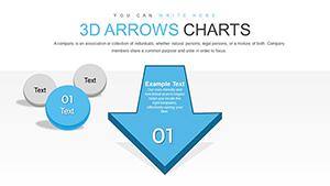
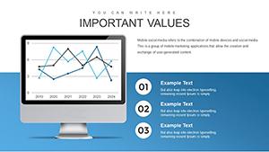
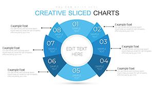
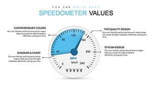
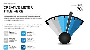
Chart templates in PowerPoint distill data into digestible forms, using geometry to encode stories. A clustered bar chart, for instance, contrasts quarterly sales by region, bars rising like competitive peaks to spotlight leaders.
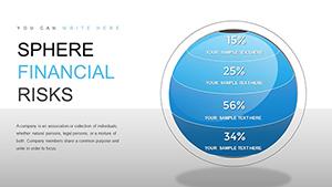
Project managers track Gantt-inspired timelines via stacked charts, while finance pros dissect budgets with donut breakdowns. Journalists visualize poll results in radar charts, plotting attributes for multi-dimensional views.
Outshining Default Chart Tools
Design Refinement: Pre-styled axes and legends eliminate bland defaults.
Automation: Conditional formatting shifts colors based on thresholds.
Interactivity: Drill-through links to source sheets.
Basics lack flair; ours add gridless options for modern minimalism. Tip: Round data to two decimals for scannability.
Chart Applications in Key Sectors
HR dashboards use heat map charts to correlate performance metrics, colors warming with scores for talent insights. E-learning platforms chart learner progress, lines curving upward to celebrate milestones.
Real estate agents display property trends in area charts, shaded regions growing with market values. Sustainability reports employ bubble charts, sizes ballooning with impact scales.
Creative Charting Techniques
Combo Charts: Layer lines over bars for dual narratives.
Trend Annotations: Arrow callouts on peaks for emphasis.
Themed Icons: Replace ticks with symbols for thematic ties.
These elevate data to art. Grab a template and plot ahead.
Best Practices for Chart Excellence
Choose chart types by data nature: categoricals for pies, continuous for lines. Calibrate scales to avoid distortion. For accessibility, include patterns alongside colors.
Test in presenter view for seamless navigation. Advanced: Pivot charts for on-the-fly slicing.
Insight: Watermark charts with sources to fortify trust.
Frequently Asked Questions
Chart your path to persuasion - download PowerPoint chart templates today.