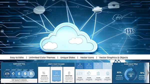
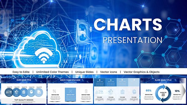
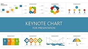
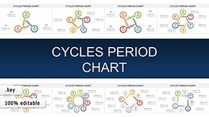
Keynote chart templates transform raw data into visually stunning stories, ideal for Apple users who demand elegance in every slide. Designed for executives, data enthusiasts, and educators, these templates make complex information accessible and engaging at a glance.
From bar graphs to pie charts, our collection emphasizes intuitive layouts that integrate seamlessly with Keynote`s animation tools. Benefits include rapid customization - adjust scales, colors, and labels effortlessly - and compatibility across Mac and iOS devices for on-the-go editing.
Audience-focused, they cater to those seeking to persuade stakeholders or teach concepts vividly. Picture a financial overview where trends pop with smooth transitions, or a classroom lesson where stats illustrate real-world impacts.
These templates save time while amplifying your message`s power. With built-in responsiveness, your charts adapt to any screen size, ensuring crisp delivery everywhere.
Browse the Keynote charts category today and elevate your data presentations with effortless sophistication.


Unlike basic Keynote defaults, which can appear cluttered, our templates prioritize minimalism and precision. They incorporate vector graphics for scalability and theme consistency, reducing manual tweaks. In professional environments, this means faster prep and sharper focus on insights rather than aesthetics.
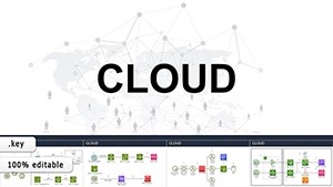
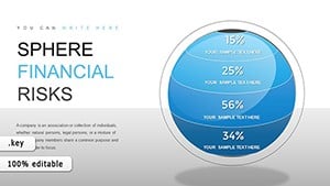
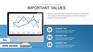
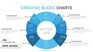
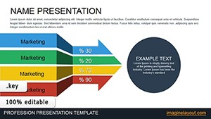
For marketing teams, pie charts in our templates highlight market shares dynamically; educators use line graphs to track progress over time. Creative agencies blend charts with icons for branded reports that feel uniquely theirs.
Versus generic tools, these offer pre-animated elements that enhance flow without extra effort. Follow best practices like limiting data points per chart - aim for 5-7 max - to avoid overload. Pair with Keynote`s build effects for phased reveals that build suspense.
Effective charts start with purpose: decide if you`re comparing, trending, or distributing data, then select accordingly. Our templates include placeholders for annotations, making it easy to add context without clutter.
Accessibility matters - use descriptive titles and color-blind-friendly palettes. Case in point: a startup founder used our funnel chart template to map customer journeys, landing investor funding through crystal-clear visuals.
Another example: a professor`s ecology lecture employed radial charts to show biodiversity, sparking student discussions. Experiment with 3D effects sparingly for depth, but flat designs often win for clarity.
Enhance further by linking charts to live data sources via Keynote integrations. Download a template now and see the difference in your next session.
Armed with these tips, your Keynote presentations will command attention. Explore more in our charts section and innovate boldly.
Copyright © 2009-2026 ImagineLayout All rights reserved.