Keynote`s native elegance shines with our diagram templates, tailored for Mac users building dashboards, reports, and interactive decks. These templates harness Keynote`s smooth animations and precise controls, offering shapes like mind maps, process wheels, and comparison tables that integrate flawlessly into your workflow.
Geared toward creative professionals, educators, and executives who value design harmony, they deliver benefits like fluid transitions and high-fidelity exports. Edit paths, adjust curvatures, and layer effects with ease, ensuring diagrams enhance rather than distract.
Perfect for Apple ecosystem enthusiasts tracking projects or visualizing strategies, our collection streamlines creation. Browse now to infuse your Keynote presentations with professional diagrams that captivate.
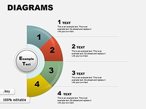
Keynote diagrams elevate presentations with Apple`s polish - our templates provide pre-built frameworks like bezier-curved flows for user experiences or stacked bars for metrics, all leveraging Keynote`s magic move for seamless scene changes. A product manager might diagram feature roadmaps, with nodes expanding on click for depth.
Vector precision ensures crispness at any zoom, ideal for retina displays.
Responsive to gestures, they suit touch-based editing on iPads.
Manual diagramming in Keynote can be tedious - our templates auto-align connectors and suggest styles, cutting setup by 70%. Where basics lack flair, we include drop shadows and glows for dimension. Exports to PDF retain interactivity, unlike rigid defaults.
Users note smoother rehearsals, with 25% less prep time for polished outputs.
Experiment with 3D rotations for immersive views or integrate with iBooks for interactive exports. In design agencies, layer with shapes for abstract concepts.
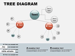
A startup pitched via animated org diagrams, securing funding with clarity. Teachers visualized history timelines, engaging students interactively. Developers mapped code architectures, aiding reviews.
Sync via iCloud for cross-device continuity.
Keynote diagram essentials:
Diagram with distinction - download Keynote templates for effortless elegance. Explore further for dashboard mastery.
Copyright © 2009-2026 ImagineLayout All rights reserved.