Visualize proportions beautifully with our extensive circle chart PowerPoint templates. These elegant designs make percentage data easy to understand and visually memorable.
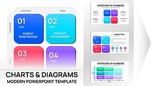
Collection of more than 100 stylish templates with modern color palettes smooth animations and full customization for current presentation needs.
Perfect for market share budget breakdowns or survey results where clarity and aesthetics matter.
Try free templates first or unlock premium for advanced donut styles and effects.
Turn complex percentages into simple compelling visuals that resonate with any audience.
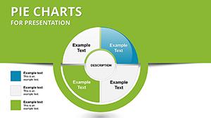
Circle charts especially pie and donut variations are unmatched for illustrating how individual parts contribute to a whole making them ideal for proportional data.
Our templates add sophistication with clean layouts and thoughtful design details.
Professionals use circle charts to communicate proportions clearly:
Marketing teams show market share distribution highlighting competitive positioning.
Finance departments present budget allocation with donut charts placing key notes in the center.
HR teams display employee survey responses by category revealing sentiment trends.
Non-profits illustrate funding sources or impact distribution.
These applications demonstrate the power of circle charts in simplifying complex distributions.
Built-in PowerPoint pies are basic. Our templates offer gradient fills 3D effects exploded slices and coordinated color schemes that elevate your slides.
Plus ready animations and multiple variations save time and improve delivery.
Create effective circle charts by:
Find your ideal circle chart template in our collection and download it now to create memorable slides.
Keep it to 6 or fewer for clarity; group smaller items into an "Other" category if needed.
Yes many templates feature donut variations perfect for adding central text or icons.
Premium versions include smooth slice-by-slice animations for engaging reveals.
Absolutely all colors are fully editable to match your branding.
Copyright © 2009-2026 ImagineLayout All rights reserved.