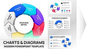
Unlock the potential of visual storytelling with our specialized cycle phase PowerPoint charts. Tailored for analysts, managers, and educators who need to depict ongoing processes clearly, these charts transform abstract concepts into tangible diagrams. From circular flows representing business cycles to phased breakdowns of project milestones, our designs emphasize continuity and progression.
Picture illustrating a product lifecycle where each phase connects seamlessly, highlighting dependencies and outcomes. Or mapping a marketing funnel that reveals drop-off points for optimization. These charts are crafted with precision, using clean lines and intuitive icons to ensure instant comprehension, regardless of audience expertise.
The advantages are clear: enhance decision-making with data-driven visuals, foster team alignment through shared understanding, and deliver presentations that resonate long after the last slide. Perfect for boardrooms or classrooms, they adapt to your narrative. Explore this category now and harness the power of cyclical visuals to elevate your communication.

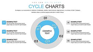


Cycle phase PowerPoint charts excel in scenarios demanding sequential clarity, such as supply chain overviews where raw materials loop back into production. In project management, they outline agile sprints, showing iteration from planning to review. Educational settings benefit from depicting scientific processes like the water cycle, making abstract lessons concrete and memorable.
Financial reports use them for revenue cycles, tracing inflows and outflows in a loop that underscores sustainability. Healthcare professionals map patient care pathways, ensuring holistic views of treatment stages. Their versatility extends to creative fields, like storyboarding film production phases for collaborative pitches.
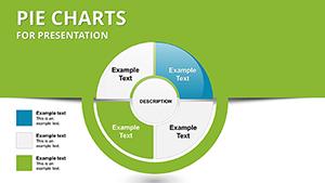
Default PowerPoint charts often result in cluttered, linear representations that fail to capture cyclical nuances, leading to misinterpretations. Our cycle phase designs, however, employ layered segments and directional arrows for natural flow, reducing cognitive load. They include scalable vectors for high-res outputs and pre-set color gradients that denote progress intuitively.
Users appreciate the embedded data links, allowing real-time updates from Excel without manual redraws - a feature absent in standard tools. This efficiency translates to sharper insights and more persuasive arguments in high-stakes environments.
These features ensure your charts not only inform but also inspire action.
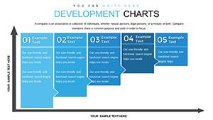
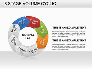
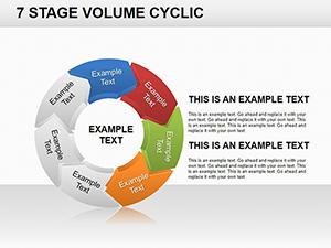
Begin by identifying key phases - limit to 4-8 for focus - and assign distinct visuals per stage. Use contrasting hues for active versus completed cycles to guide the eye. Integrate animations sparingly, revealing phases sequentially to build suspense. Always pair charts with concise annotations, avoiding jargon for broader accessibility.
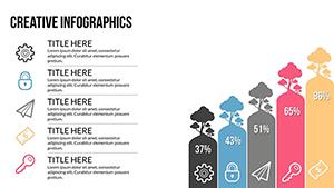
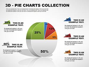
For advanced applications, overlay metrics like percentages within arcs to quantify impact. In strategy sessions, facilitate discussions by pausing on interactive elements, encouraging input on bottlenecks.
A logistics firm adopted our cycle chart for inventory management, visualizing reorder loops that cut stockouts by 25%. An environmental NGO illustrated climate feedback cycles, boosting donor engagement through vivid, looping depictions of cause and effect. These examples highlight how targeted visuals drive measurable outcomes.
Peruse our cycle phase PowerPoint charts and choose a design that aligns with your objectives. Instant access means you can prototype and refine in minutes.
Copyright © 2009-2026 ImagineLayout All rights reserved.