Delve into the rhythm of repetition with periodic cycle diagram templates crafted for Keynote. These specialized visuals track oscillating patterns, from economic waves to seasonal trends, infusing your slides with analytical depth.
Aimed at analysts, planners, and academics, they offer layered structures for multi-period overlays, blending precision with aesthetic appeal. Decode data`s dance effortlessly.
Edit hues to match datasets, layer timelines for comparisons, and animate peaks for emphasis. Prioritize insights over effort with our ready-made elegance. Scan our range and pinpoint your periodic powerhouse.
Harmonize your data. Download today and orchestrate outstanding Keynote flows.
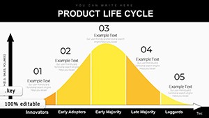
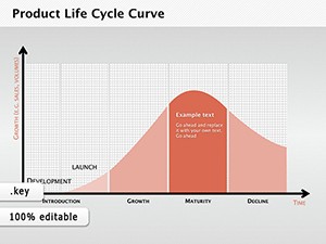
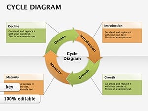
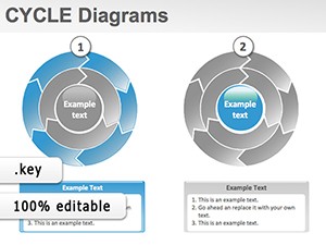
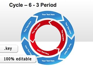
Periodic cycle diagrams spotlight recurring fluctuations over time, using sinusoidal waves or segmented rings to map highs and lows. In Keynote, they leverage build effects to unfold periods sequentially, revealing trends progressively.
Contrasting static bar charts, these diagrams evoke motion and predictability, perfect for forecasting or historical reviews. Our templates embed timeline axes for accurate scaling.
Generic Keynote periods appear flat; ours introduce curved connectors and gradient fills for a pulsating, data-driven vibe.
Financial advisors plot market cycles, annotating bull and bear phases with alert icons. Environmental scientists diagram climate oscillations, integrating satellite imagery hotspots.
Biologists trace lunar influence on tides via tidal cycles, with phase labels. Urban planners visualize population booms in decadal rings.
Calibrate axis scales to your timeframe, using logarithmic options for exponential growth. Incorporate legends with swatch previews for instant legibility.
Sync animations to data pulses, creating a heartbeat effect. Group elements for bulk edits, streamlining revisions.
A retail chain`s seasonal sales cycle pulses with holiday spikes, guiding inventory tweaks. Astronomy decks wave through planetary orbits, with orbital speeds noted.
Health reports cycle vaccination efficacy over years, peaking at immunity thresholds to advocate boosters.
Nuance: Vary line thicknesses to denote impact magnitude, adding analytical layers.
Navigate periodic visuals with confidence.
Pulse with purpose. Acquire your template and pattern your path to precision!
Copyright © 2009-2026 ImagineLayout All rights reserved.