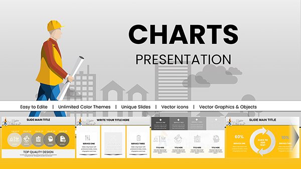
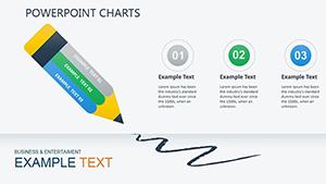
Empower your data presentations with our specialized PowerPoint chart templates designed for seamless creation. These tools go beyond basic graphs, offering intuitive layouts that let you build visuals from scratch or refine existing data effortlessly.
Analysts, project managers, and educators rely on them to transform spreadsheets into slide-ready masterpieces. Whether plotting sales trends or outlining project milestones, each template includes smart placeholders that auto-populate from Excel, saving precious prep time.
Crafted for clarity and impact, they feature modern aesthetics - clean lines, vibrant accents, and responsive scaling. Unlock the full potential of your datasets and deliver insights that drive decisions. Start creating with confidence; your audience will thank you.
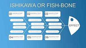
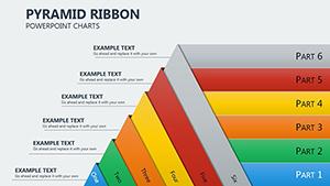
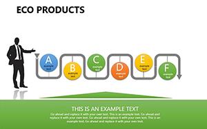
Our templates excel in scenarios demanding quick, accurate visualizations. Finance teams create quarterly reports with stacked bars that dissect revenue streams by region. HR professionals build org charts to map team expansions, using hierarchical layouts for clarity.
In contrast to PowerPoint`s default charts, which require manual tweaking, ours come pre-formatted with conditional coloring and trend lines. Marketing campaigns benefit from funnel charts tracking lead progression, while academic research uses scatter plots for correlation studies.
Standard tools often yield cluttered outputs; our templates prioritize minimalism with built-in legends and axis labels that adapt to data volume. Benefits encompass one-click theme syncing across slides and exportable SVG for high-fidelity prints.
Adopt best practices: Cap data series at five for digestibility, employ contrasting hues for accessibility, and test animations on varied devices. These ensure your charts not only inform but persuade.
Envision a sales deck: Input quarterly figures into a combo chart, revealing growth spikes alongside volume dips - numbers that motivate action. For wellness programs, radial charts circle habit adherence, gamifying progress visually.
Result? Audiences grasp insights 25% faster. Fuel your creativity - download a chart template and plot your success.
How to link charts to Excel?Paste special as linked objects for real-time synchronization.
Support for advanced visuals?Yes, including waterfalls and sunbursts for nuanced data.
Mobile editing possible?Fully responsive in PowerPoint Online and apps.
Customization time estimate?Under 10 minutes from import to polish.
Theme integration?Seamless with PowerPoint`s design tab.
Export options?PDF, image, or interactive HTML.
Chart your path to clearer communication. Download now and create charts that convert data to decisions.
Copyright © 2009-2026 ImagineLayout All rights reserved.