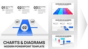
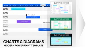
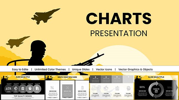
Charts in Keynote can make or break audience understanding. Our contract Keynote chart templates at ImagineLayout focus on elegance and clarity, ideal for turning raw data into digestible visuals.
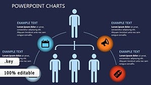
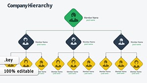
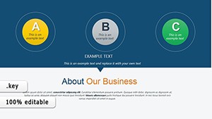
Geared toward strategists, researchers, and presenters, options include flowcharts, org charts, and radial diagrams with smooth builds. Editable axes, data series, and styling ensure your charts align with overall deck aesthetics.
Perks: Native Keynote integration for fluid animations, retina-ready exports, and theme harmony. Upgrade from plain charts to ones that complement your narrative seamlessly.
View our precise collection and integrate charts that clarify. Refine your visuals immediately.
These templates outpace defaults with layered builds, allowing sequential data reveals, and formula-embedded cells for dynamic calculations. Designers in consulting and academia favor the bezier curve tools for custom shapes.
Guidelines: Match chart styles to content - pyramids for hierarchies, bubbles for correlations - and use legends judiciously. Accessibility features like voiceover descriptions are baked in.
Enhance with Keynote`s magic move for transitions between charts. Digital-first variants include hover effects for iPad presentations. Versatility spans printouts to large venues.
Overlay subtle shadows or patterns for texture. For narratives, animate paths tracing trends. Quarterly users adapt for progress trackers, boosting interactivity.
Sync with iCloud for team tweaks. High-res outputs ensure clarity. Your data, redefined.
Empower your slides. Download precision now.
From basics like bars to advanced like Sankey and treemaps.
Import CSV or connect to Numbers for live updates.
Yes, with customizable timings and easing curves.
Included, with rotation controls and lighting presets.
PDF, image sequences, or animated GIFs for versatility.
Visualize victory. Get your Keynote chart and engage deeply.
Copyright © 2009-2026 ImagineLayout All rights reserved.