Content charts blend data visualization with meaningful text to create informative memorable slides. Our library of over 120 Keynote content chart templates helps you present statistics alongside explanations annotations and key takeaways.
These modern animated templates feature generous text areas smart layouts and harmonious visuals perfect for detailed reports or educational material.
Fully customizable in minutes they let you adapt colors fonts and placement to your brand while maintaining professional balance.
Move beyond plain charts and create slides that both inform and engage in presentations.
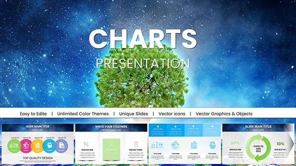
Premium Secure Cloud Business Charts for Keynote Presentations
ID: #KC01024
$18.00
(190)
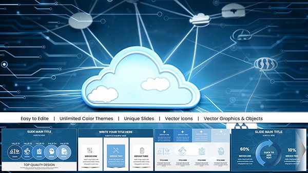
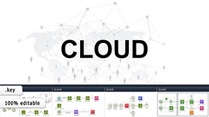
Cloud Network Presentation Template with Charts for Keynote
ID: #KC01023
$15.00
(222)
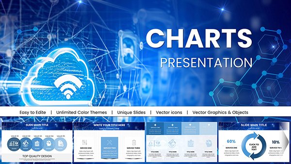
Interactive Slides Keynote Charts: Orchestrate IT Networks with Precision
ID: #KC00923
$22.00
(518)
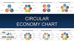
Circular Economy Keynote Charts: Close the Loop on Sustainable Storytelling
ID: #KC00908
$20.00
(482)
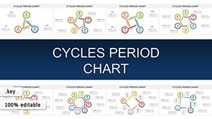
Cycles Period Keynote Template: Animate the Rhythm of Recurring Business Patterns
ID: #KC00907
$18.00
(1137)
Circular Economy Charts for Keynote: Weaving Sustainability into Every Slide
ID: #KC00904
$15.00
(1065)
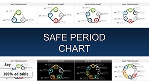
Safe Period Charts for Keynote: Illuminating the Rhythms of Change
ID: #KC00903
$20.00
(196)
Project Cycle Steps Keynote Charts: Charting Pathways to Project Triumph
ID: #KC00902
$20.00
(370)
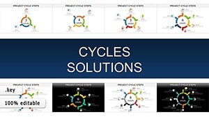
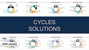
Cycles Solutions Keynote Charts: Transform Data into Compelling Narratives
ID: #KC00901
$20.00
(551)
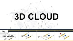
3D Cloud Storage Keynote Charts - Fully Editable | ImagineLayout
ID: #KC00900
$18.00
(1195)
Cloud Data Storage Keynote Charts: Scalable Visuals for Pros
ID: #KC00899
$18.00
(32)
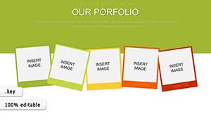
Our Portfolio Keynote Charts
ID: #KC00886
$20.00
(137)
Business Infographic Keynote Charts for Compelling Data Narratives
ID: #KC00875
$20.00
(965)
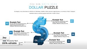
Dollars Puzzles Keynote Charts: Decode Economic Influences with Visual Mastery
ID: #KC00837
$13.00
(347)
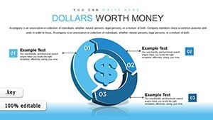
Dollars Worth Money Keynote Charts: Navigate Global Finance with Cycle Visuals
ID: #KC00835
$15.00
(529)
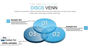
Transforming Complex Data with 3D Venn Keynote Charts
ID: #KC00811
$22.00
(344)
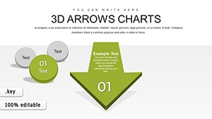
3D Arrows Effective Keynote Charts Presentation
ID: #KC00805
$20.00
(241)
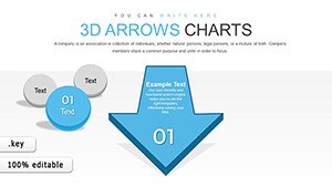
3D Arrows Keynote Charts Template
ID: #KC00804
$25.00
(484)
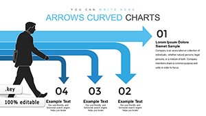
Curved Arrows Keynote Charts Template
ID: #KC00802
$16.00
(882)
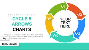
Cycle 5 Arrows Keynote Charts: Streamline Your Process Visualizations
ID: #KC00779
$18.00
(741)
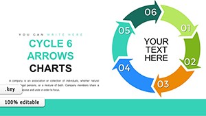
Cycle 6 Arrows Keynote Charts: Enhance Workflow Depictions with Precision
ID: #KC00778
$18.00
(140)
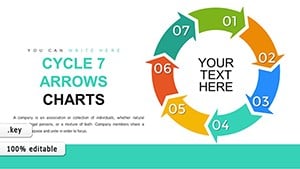
7-Step Cycle Arrows Keynote Charts Template: Streamline Your Process Visualizations
ID: #KC00777
$18.00
(386)
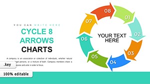
8-Step Cycle Arrows Keynote Template: Master Complex Process Flows
ID: #KC00776
$18.00
The Value of Content-Rich Charts
Pure data charts can feel cold. Content charts add context narrative and emphasis turning numbers into stories that audiences remember.
Our templates provide ready frameworks that balance visuals and text for maximum clarity and impact.
Practical Use Cases
Annual Reports
Show financial metrics with detailed explanations of performance drivers.
Content Marketing
Present blog traffic alongside top-performing topics and insights.
Educational Decks
Combine timelines with historical context and learning objectives.
Product Overviews
Display feature adoption rates with customer benefit descriptions.
Why Choose Professional Templates
Perfect text-to-visual balance built-in
Clean typography hierarchies
Subtle animations that highlight key messages
Responsive layouts for any screen
High-resolution icons and graphics
Best Practices for Content Charts
Keep text concise and scannable. Use hierarchy with headings and bullet points. Align visuals with related text. Choose colors that guide attention. Animate text and data in sync.
Our templates follow these rules so your slides look expert-designed from the start.
Want slides that inform and inspire? Explore our content chart collection and download your favorites now.
Frequently Asked Questions
What defines a content chart?
A content chart integrates substantial text annotations explanations or narratives directly with data visuals for deeper understanding.
How much text can these templates hold?
Layouts accommodate paragraphs bullet lists and callouts while maintaining visual balance.
Are the designs mobile-friendly?
Yes. All templates adapt beautifully to iPad and projector displays.
Do you provide free content chart templates?
Yes. Many free options are available plus premium versions with extra layouts.