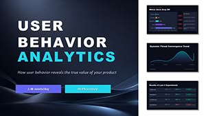
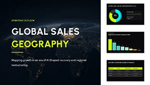
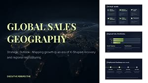
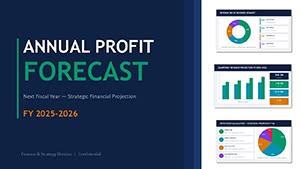
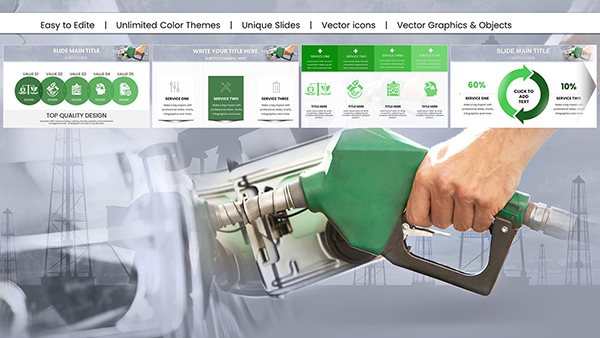
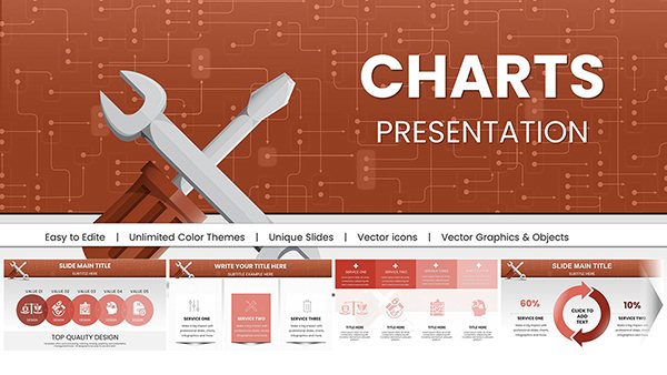
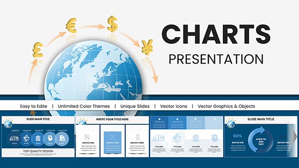
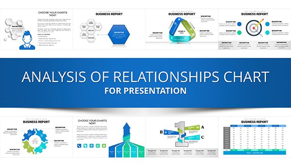
Charts are essential for turning raw data into compelling stories, helping audiences grasp trends, comparisons, and forecasts at a glance. Our PowerPoint chart templates simplify this process, offering a range of styles from bar graphs to pie diagrams, all optimized for seamless integration into your slides.
Ideal for analysts, educators, marketers, and executives, these templates address common pain points like cluttered visuals or inconsistent scaling. You`ll appreciate the drag-and-drop compatibility, allowing quick updates to datasets while preserving aesthetic appeal. Benefits include enhanced clarity - reducing misinterpretation risks - and time savings, as pre-formatted axes and legends eliminate manual tweaks.
Whether illustrating sales growth or survey results, our designs emphasize readability with clean lines and intuitive color coding. Transform mundane numbers into persuasive narratives that drive decisions and discussions.
Browse our chart collection and elevate your next presentation effortlessly.
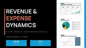

In a world flooded with information, charts cut through the noise by distilling complexity into digestible visuals. Unlike static spreadsheets, our PowerPoint templates animate transitions and hover effects, making data interactive and memorable. For business pitches, a well-crafted line chart can forecast revenue trajectories, swaying investors with projected peaks and valleys rendered in smooth curves.
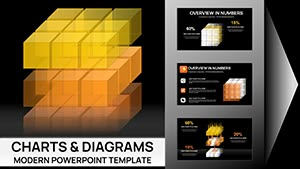
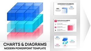
Target audiences vary: sales teams use funnel charts to track conversion rates, while educators employ scatter plots to correlate study hours with grades. The edge over default PowerPoint charts? Our versions include thematic variants - like minimalist wireframes for tech demos or vibrant gradients for creative reports - ensuring alignment with your slide deck`s tone.
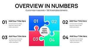
Best practices advocate for simplicity: limit data series to five per chart and use labels over legends for instant comprehension. Our templates enforce this with built-in constraints, preventing overload.
PowerPoint`s built-in charts often default to garish colors and rigid proportions, demanding extensive reformatting. In comparison, ours arrive with vector-based elements for crisp scaling across devices and embedded data tables for effortless Excel imports. A user testimonial notes a 40% faster prep time, attributing it to one-click theme swaps that unify your entire presentation.
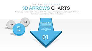
Advanced features like 3D rotations add depth without distortion, ideal for product demos where spatial relationships matter. For global teams, multilingual placeholders support diverse scripts, broadening accessibility.
Leverage combo charts for multifaceted stories, such as overlaying sales lines on volume bars to uncover correlations. In education, interactive quizzes can embed radar charts for self-assessment, fostering engagement. Tips include sourcing royalty-free icons for annotations and testing animations on varied hardware to ensure smooth playback.
These strategies amplify impact, turning data dumps into dialogue starters.
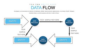
Explore Sankey diagrams for resource flows in supply chain analyses or bubble charts for multi-variable comparisons in market research. Templates include gradient fills that denote intensity, like heat maps for risk assessments. In creative fields, artists repurpose polar area charts for mood boards, visualizing inspiration sources radially.
Unique propositions encompass sustainability-themed palettes for eco-reports and AI-generated placeholders for rapid prototyping. Collaborate via shared links, iterating designs collectively for refined outcomes.
Seize the opportunity - grab a template now and chart your path to clearer communications.
From bar, line, and pie to advanced Sankey and radar charts, covering diverse data representation needs.
Yes, designed for backward compatibility down to PowerPoint 2016, with fallback options for earlier editions.
Simply edit the linked Excel sheet or use the built-in data editor for direct input and automatic refreshes.
Absolutely, with preset entrance and emphasis effects that enhance flow without overwhelming the slide.
Vector elements ensure scalability, maintaining sharpness at any size from thumbnails to full-screen views.
Yes, global theme editors let you apply brand colors across all chart components instantly.
Harness these tools to make your data not just seen, but understood and acted upon.
Copyright © 2009-2026 ImagineLayout All rights reserved.