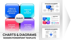
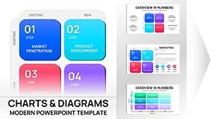
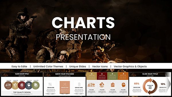
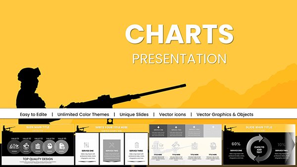
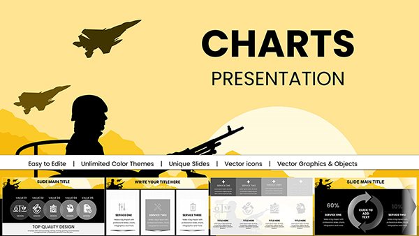
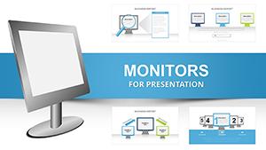
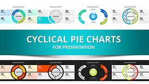
Capture audience attention with our concept PowerPoint chart templates, where data visualization meets artistic expression. These slides feature innovative layouts like curved flows and layered diagrams, ideal for illustrating trends, comparisons, or processes in business reviews or academic talks.
Tailored for users who want more than plain bars and lines, the templates incorporate thematic backgrounds and icons that align with your narrative. Easily swap datasets, tweak colors for branding, and animate transitions to guide viewers through your story. From sales forecasts to research findings, they make complex info accessible and engaging.
Built for efficiency, each template includes pre-set axes, legends, and placeholders, saving hours of manual setup. Professionals in analytics, consulting, or education appreciate the balance of creativity and clarity, ensuring slides that inform without overwhelming.
Transform numbers into narratives. Peruse our collection and integrate these charts into your next deck seamlessly.
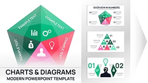
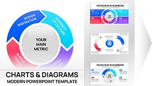
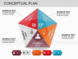
Concept chart templates in PowerPoint revolutionize how you present figures by embedding contextual visuals. Standard charts often appear flat, but ours add depth through metaphorical elements - a Sankey flow for resource allocation or a radar plot with orbital paths for multi-faceted evaluations. This elevates mundane reports into persuasive tools.
In corporate environments, deploy them for quarterly earnings slides that highlight growth trajectories vividly. Researchers use scatter plots with conceptual overlays to correlate variables intuitively. Educators craft lesson recaps with pie charts framed in thematic borders, aiding retention.
Superior to defaults, these templates boast smart objects for effortless data linking and animation presets that reveal insights progressively, keeping viewers hooked.
Start by inputting your data via Excel integration for real-time updates. Harmonize colors with your slide theme using eyedropper tools, and layer subtle animations to unveil elements sequentially. For polish, add tooltips or hyperlinks to supporting details, turning static charts into interactive experiences.
Best practice: Limit to 3-5 data series per chart to avoid clutter, focusing on the key takeaway. Test on different projectors to ensure legibility from afar.
Our edge? Curated for conceptual clarity, these templates foster deeper understanding, with users citing 30% better engagement in feedback. They`re not just slides - they`re storytelling devices.
Download today and chart your path to standout presentations.
Quick answers to your chart template inquiries.
Need further assistance? Our guides cover advanced tweaks.
Copyright © 2009-2026 ImagineLayout All rights reserved.