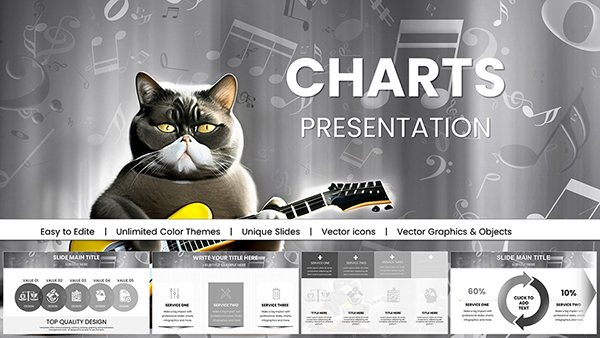
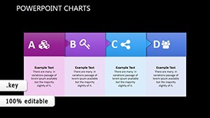
Make informed decisions pop with our comparison chart templates for Keynote. Geared toward analysts, consultants, and product managers, these charts juxtapose options side-by-side, revealing strengths, gaps, and opportunities with elegant precision.
Featuring matrix layouts, Venn overlaps, and radar plots, they handle everything from feature lists to metric battles. Customizable axes and legends let you tailor contrasts to your narrative, ensuring every presentation lands with authority.
These designs prioritize balance - symmetrical structures that guide eyes logically, avoiding bias in visuals. Perfect for high-stakes pitches where clarity wins deals.
Scan our assortment for the chart that amplifies your comparisons. Quick Keynote integration gets you presenting confidently ASAP.
Transfer Credits Keynote Charts Template: Master Financial Transfers with Dynamic Visuals
ID: #KC00420
$18.40
(1084)
Algorithmic Trading Keynote Charts Template: Visualize Financial Strategies with Ease
ID: #KC00419
$14.00
(73)
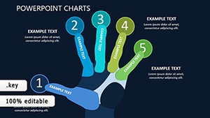
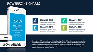
Mobile Apps Keynote Charts: Chart Your Path to App Dominance
ID: #KC00415
$16.00
(939)
Illuminate Strategies in the Dark: Long-Term Plan Keynote Charts
ID: #KC00373
$18.00
(252)
Social Networks Infographic Keynote Charts - Ready to Present | ImagineLayout
ID: #KC00348
$14.00
(444)
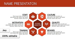
Empower Your Team with Successful Staff Keynote Charts
ID: #KC00337
$16.00
(1110)
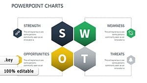
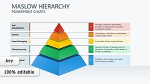
Maslow's Hierarchy Keynote Charts: Fuel Motivation in Every Slide
ID: #KC00282
$14.00
(1012)
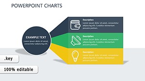
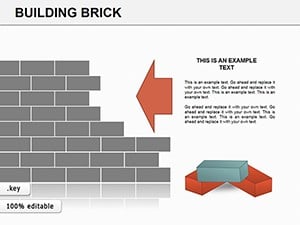
Building Bricks Keynote Charts: Construct Compelling Narratives
ID: #KC00195
$26.00
(483)
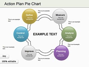
Action Plan Pie Charts Keynote Template
ID: #KC00187
$23.00
(28)
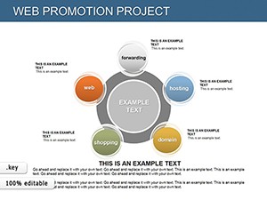
Web Promotion Keynote Charts: Ignite Your Digital Strategy
ID: #KC00183
$23.00
(320)
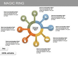
Magic Ring Keynote Charts: Visualize Cycles with Elegance
ID: #KC00182
$18.00
(97)
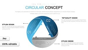
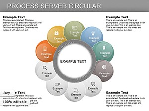
Circular Process Keynote Charts: Map Workflows in Elegant Cycles
ID: #KC00180
$27.00
(121)
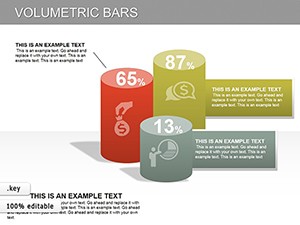
3D Volumetric Bars Keynote Charts: Bring Data to Life in Dimensions
ID: #KC00179
$26.00
(568)
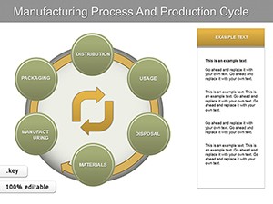
Manufacturing Process Keynote Charts: Visualize Production Cycles with Precision
ID: #KC00178
$25.00
Elevating Decisions with Comparison Charts
Comparisons drive choices in business and beyond, and our Keynote charts streamline this by framing data objectively. They transform raw numbers into strategic stories, helping stakeholders weigh pros and cons effortlessly.
Diverse Scenarios for Use
Software Evaluators: Pit tools against each other in feature radars, spotlighting ROI drivers.
Market Researchers: Contrast consumer preferences via stacked bars for trend insights.
Investors: Analyze portfolio options with bubble charts, sizing by risk-reward.
Educators: Compare historical events in timeline matrices for engaging lessons.
Superior to plain tables, these charts employ color gradients for instant hierarchies, enhancing retention over monotonous lists. The result? Audiences grasp nuances faster, accelerating consensus.
Refinement Techniques
Neutralize visuals: Use consistent scales to prevent skewed perceptions.
Annotate key diffs: Add callouts for standout variances without clutter.
Sequence reveals: Animate elements to build arguments progressively.
Validate sources: Footnote data origins for credibility boosts.
In a recent boardroom, a VP leveraged our pros-cons matrix to compare vendors, clinching a cost-saving contract on the spot. Get creative: Merge comparisons with SWOT overlays for multidimensional views that provoke thought.
Sharpen your analyses - pick a template and illuminate paths forward.
Superiority of Our Comparison Designs
Crafted for versatility, these templates scale from duo contrasts to multi-option showdowns, with modular components for easy expansion. They outpace built-ins with thematic versatility - corporate clean to vibrant pops.
Advanced idea: Interactive toggles via hyperlinks switch views mid-presentation, tailoring depth to queries. For global audiences, multilingual labels ensure inclusivity across borders.
Weaving Comparisons into Stories
Position charts as pivotal chapters - precede with context, follow with implications - to forge compelling arcs. This narrative integration has turned dry data sessions into dynamic dialogues, unlocking innovative solutions.
Empower your insights - download today and compare with confidence.
Frequently Asked Questions
What chart types are best for product comparisons?
Radar and matrix charts excel at multi-attribute evaluations, revealing patterns at a glance.
How to handle unequal data sets?
Normalize scales or use placeholders to maintain fairness and visual harmony.
Can I add images to comparisons?
Yes, integrate photos or icons in cells for richer, more relatable contrasts.
Are they animation-ready?
Pre-configured paths highlight differences sequentially, building persuasive momentum.
What about accessibility features?
High-contrast modes and screen-reader tags ensure broad usability.