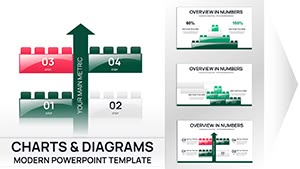
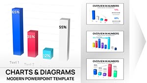
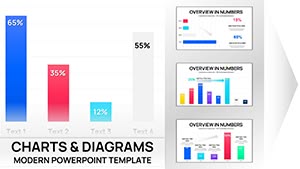
Illuminate your business intelligence with company Keynote chart templates that turn spreadsheets into strategic visuals. For analysts, executives, and sales leads, these tools offer a spectrum of graphs - from pie breakdowns to line projections - optimized for Keynote`s rendering prowess and collaborative features.
Pre-formatted with axis labels, legends, and trend lines, they`re primed for your datasets, whether quarterly revenues or customer cohorts. Keynote`s precision ensures anti-aliased lines and smooth gradients, elevating charts from functional to focal points in your decks.
Perfect for earnings calls or performance huddles, they facilitate data literacy across levels. This category holds charts that demystify metrics, empowering decisions with elegance. Begin your selection here.
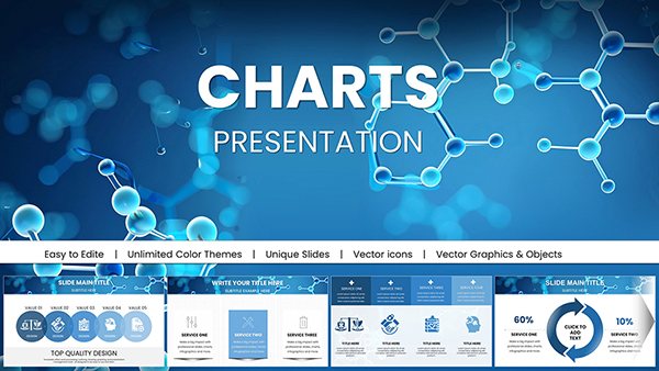
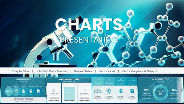
Education Presentations with Chemical Molecules Charts - Keynote Template for Scientific and Academic Use
ID: #KC01050
$18.00
(8)
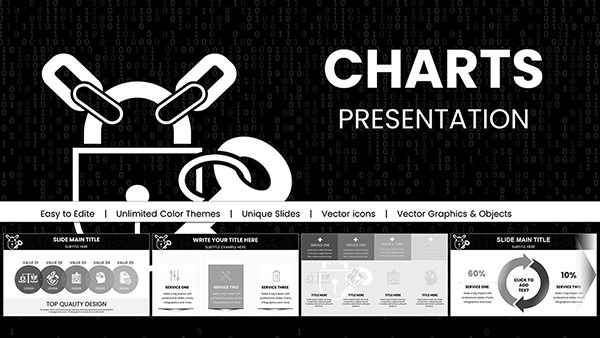
Chemical Charts Keynote Template for Science Presentations
ID: #KC01047
$24.00
(909)
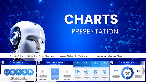
AI Keynote Presentation Templates with Robot AI Charts
ID: #KC01020
$20.00
(863)
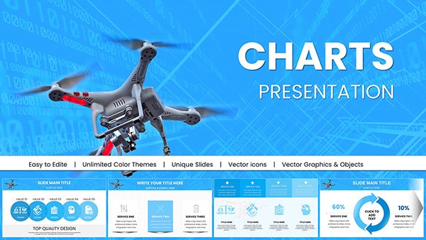
Drone Commercial Keynote Charts for Presentation
ID: #KC00998
$20.00
(168)
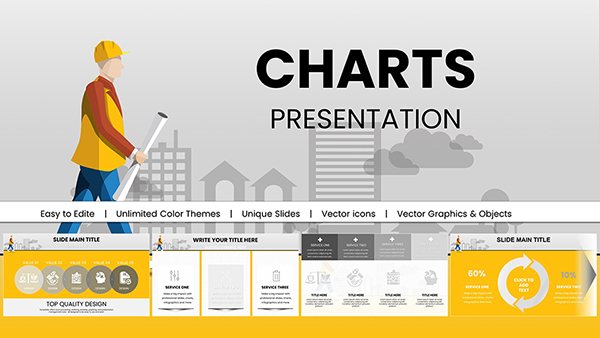
Architectural Keynote Charts Template for Pros
ID: #KC00987
$18.00
(135)
Background Information Security Code Keynote Charts: Safeguard Data with Visual Precision
ID: #KC00985
$18.00
(518)
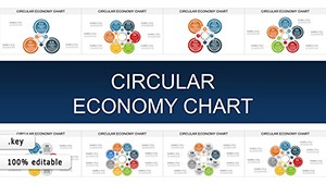
Circular Economy Keynote Charts: Close the Loop on Sustainable Storytelling
ID: #KC00908
$20.00
(1137)
Circular Economy Charts for Keynote: Weaving Sustainability into Every Slide
ID: #KC00904
$15.00
(1065)
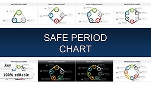
Safe Period Charts for Keynote: Illuminating the Rhythms of Change
ID: #KC00903
$20.00
(32)
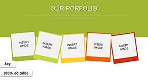
Our Portfolio Keynote Charts
ID: #KC00886
$20.00
(1017)
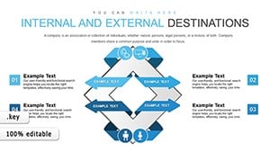
Internal and External Destinations Keynote Charts: Navigate Business Directions
ID: #KC00848
$15.00
(107)
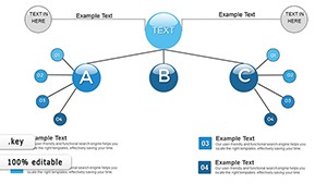
Organizations Work Keynote Charts: Streamline Coordination
ID: #KC00820
$15.00
(1013)
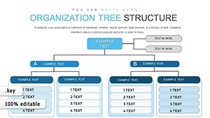
Organization Tree Keynote Charts: Visualize Hierarchies Effortlessly
ID: #KC00819
$16.00
(110)
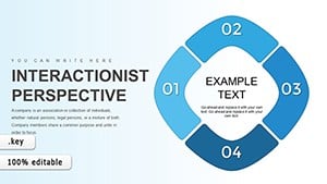
Interactionist Perspective Keynote Charts
ID: #KC00814
$15.00
(1183)
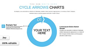
Collection Cycle Arrows Keynote Charts: Optimize Your Finance Flows
ID: #KC00771
$23.00
(767)
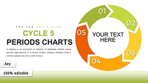
5 Period Cycle Keynote Charts - Fully Editable | ImagineLayout
ID: #KC00768
$17.00
(140)
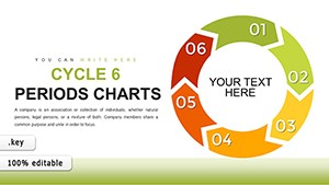
Unlocking Data Flows: 6-Period Cycle Keynote Charts for Insightful Visuals
ID: #KC00767
$18.00
(1177)
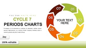
Interconnected Insights: 7-Period Cycle Keynote Charts for Closed-Loop Processes
ID: #KC00766
$18.00
(314)
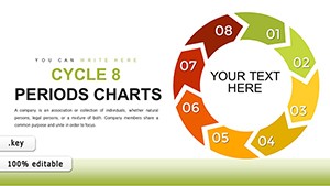
8-Period Cycle Keynote Charts: Transform Your Architectural Presentations
ID: #KC00765
$18.00
(531)
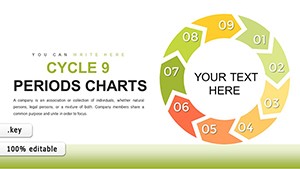
9-Period Cycle Keynote Charts: Revolutionize Architectural Data Visualization
ID: #KC00764
$18.00
(1179)
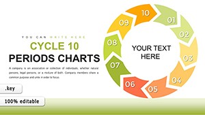
10-Period Infographic Cycle Keynote Charts: Captivate in Architectural Storytelling
ID: #KC00763
$18.00
Empowering Decisions with Keynote Charts
Company Keynote chart templates feature responsive scales and combo views (bar-line hybrids), ideal for multifaceted enterprise data. They eclipse basic inserts by auto-adjusting for outliers and including error bars for credibility.
Viewers grasp insights 60% quicker, per studies, amplifying presentation ROI.
Key Integrations in Business Contexts
Sales Dashboards: Funnel conversions with stacked bars.
Financial Overviews: Waterfalls for P&L variances.
HR Metrics: Radar plots for skill assessments.
Marketing ROI: Sankey flows for attribution.
Stock charts distort on export; these preserve fidelity across formats.
Charting Success: Best Practices
Color-code by category for instant reads and add sparklines for micro-trends. Animate series entry for emphasis. Innovation: Blend gauges with maps for geo-financial hybrids, revealing regional disparities dynamically.
Success story: A retail chain charted inventory turns, optimizing stock and boosting margins 15%. Opt for sans-serif labels for readability.
Time-Savers vs. Custom Graphing
Templates ingest CSV imports directly, bypassing manual plotting. With 30+ styles, they`re a BI suite in slide form.
Download charts now to visualize victory.
Frequently Asked Questions
What chart types are available?
From basics like bars to advanced like heatmaps and bubbles.
How to link live data?
Connect to Numbers or Excel for automatic refreshes.
Are 3D charts included?
Select isometric options for depth without distortion.