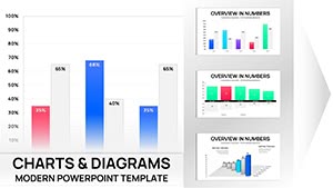
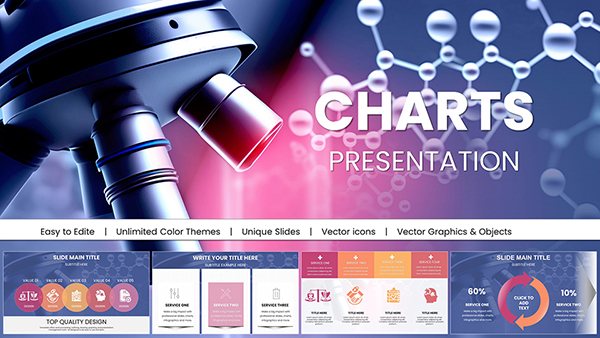
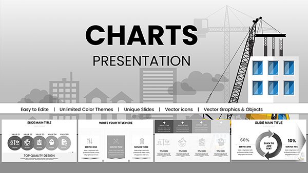
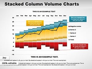
Combo charts transform complex data into clear compelling stories. Our collection of over 100 professional Keynote combo chart templates lets you combine bars lines areas and more on a single slide for instant insights.
Each fully editable animated template is crafted for presentation trends with clean layouts vibrant colors and smooth transitions that keep audiences engaged.
Save hours of design time while achieving results far beyond default Keynote charts. Customize colors fonts and data in minutes to match your brand perfectly.
Whether you need financial comparisons sales trends or marketing metrics these ready-to-use templates deliver professional polish every time.
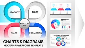
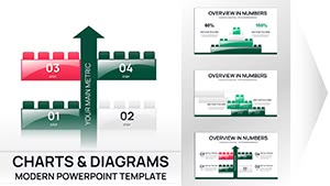
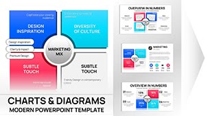
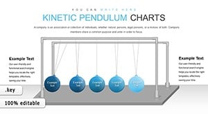
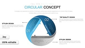
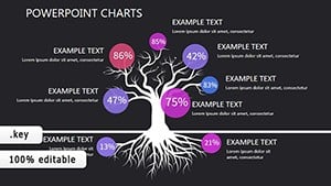
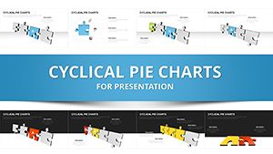
Combination 3D Puzzles Keynote Charts: Creative Tools for Business Insights
ID: #KC00010
$22.00
Why Combo Charts Excel in Keynote Presentations
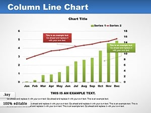
Combo charts shine when you need to show relationships between different data sets. A bar column can display volumes while a line reveals trends over time. This dual view makes patterns and outliers immediately visible without flipping between slides.
Our templates take this further with pre-built animations that reveal data progressively guiding your audience through the story step by step.
Real-World Applications
Financial Reporting
Show revenue volumes as columns and profit margins as a line. Highlight growth opportunities instantly.
Sales Dashboards
Combine units sold with average deal size to reveal performance drivers.
Marketing Analytics
Display campaign reach as bars and conversion rates as a line for clear ROI visualization.
Project Updates
Track completed tasks against budget burn for transparent status reports.
Benefits Over Default Keynote Charts
Built-in professional animations unavailable in standard charts
Harmonious color schemes designed for readability
Multiple layout variations for different data stories
Vector elements that stay sharp at any size
Easy data swapping from spreadsheets
Design Tips for Maximum Impact
Limit yourself to two chart types for clarity. Use strong color contrast between series. Align secondary axes carefully. Add subtle animations to build the chart gradually. Include data labels only on key points to avoid clutter.
Our templates already follow these principles so you can focus on your message.
Ready to create standout presentations? Browse the full collection and download your favorite combo chart templates today.
Frequently Asked Questions
What exactly is a combo chart?
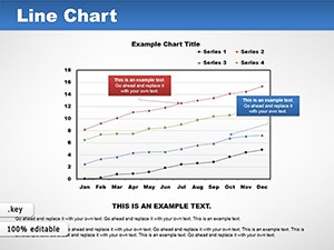
A combo chart combines multiple chart types usually columns and lines on shared axes to compare related data sets effectively.
Are these templates fully customizable?
Yes. Every element including charts colors text and animations is 100% editable in Keynote.
Do the templates include animations?
Most feature smooth professional animations to reveal data progressively.
Are free versions available?
Yes. We offer numerous free templates alongside premium options with advanced features.